Brand&People
ENG / ESP
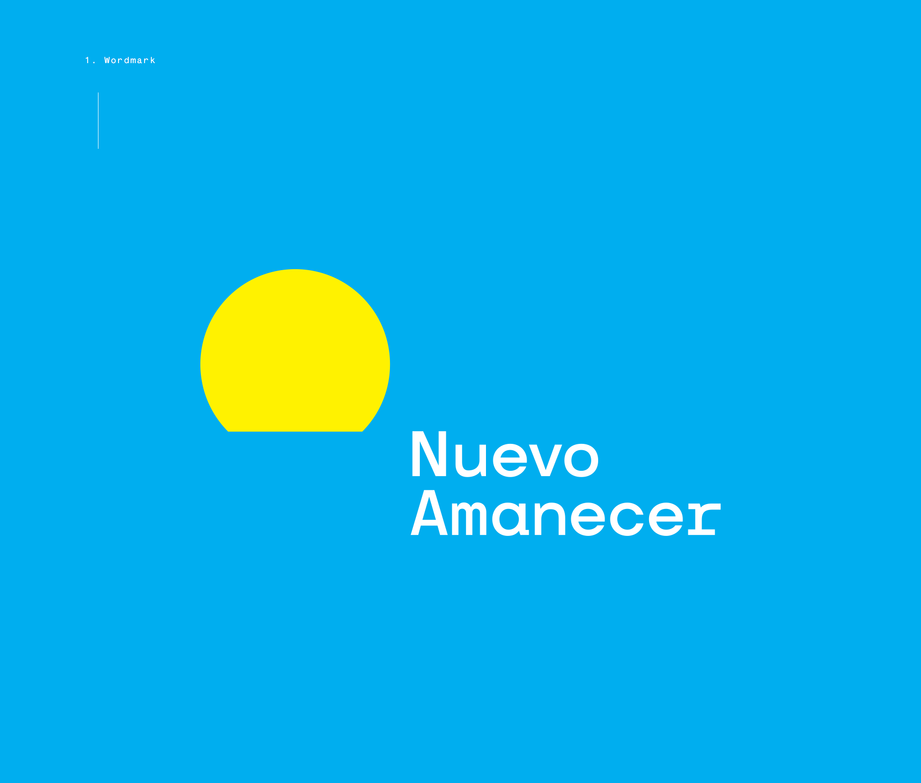
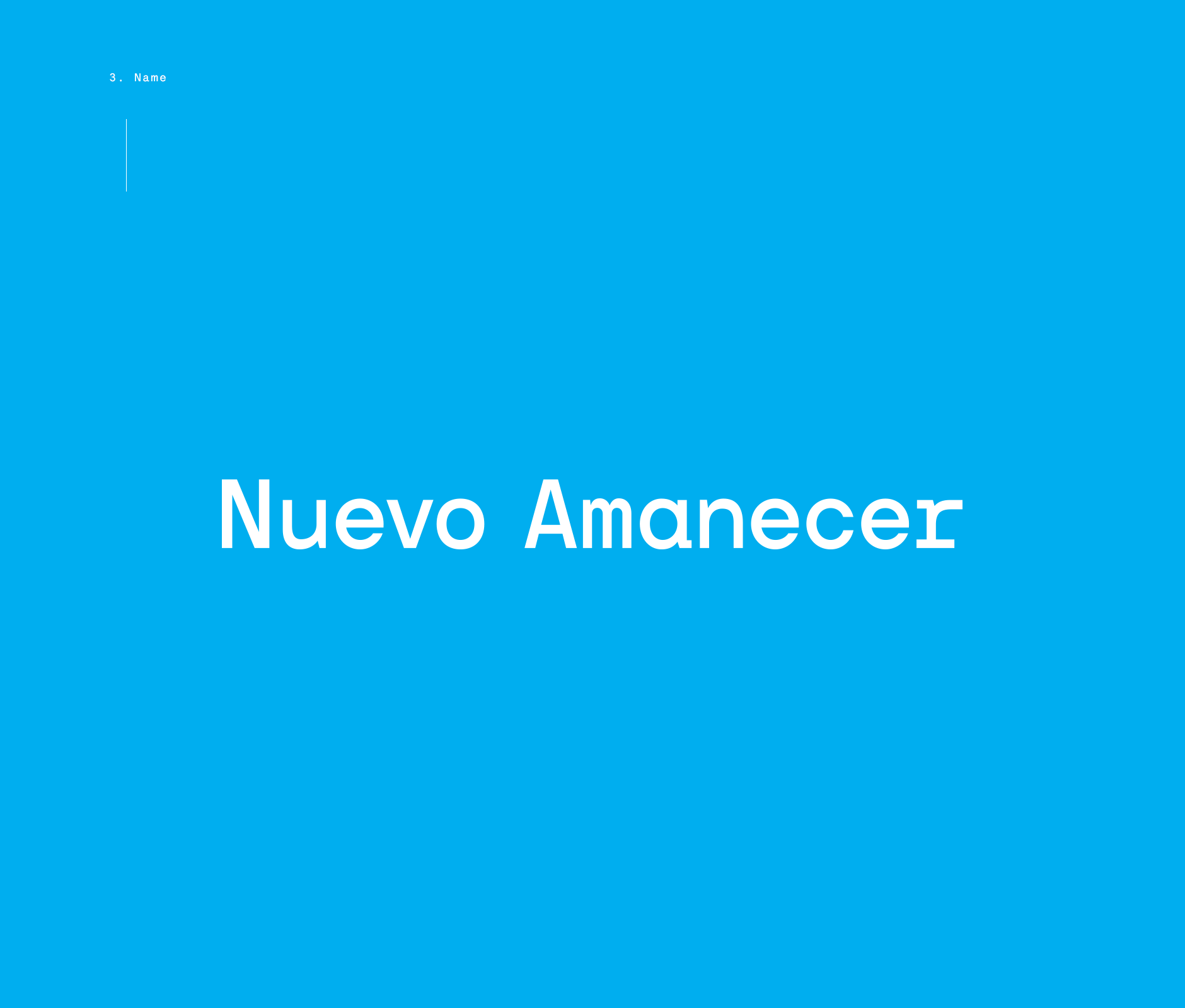
Nuevo Amanecer
A New Movement
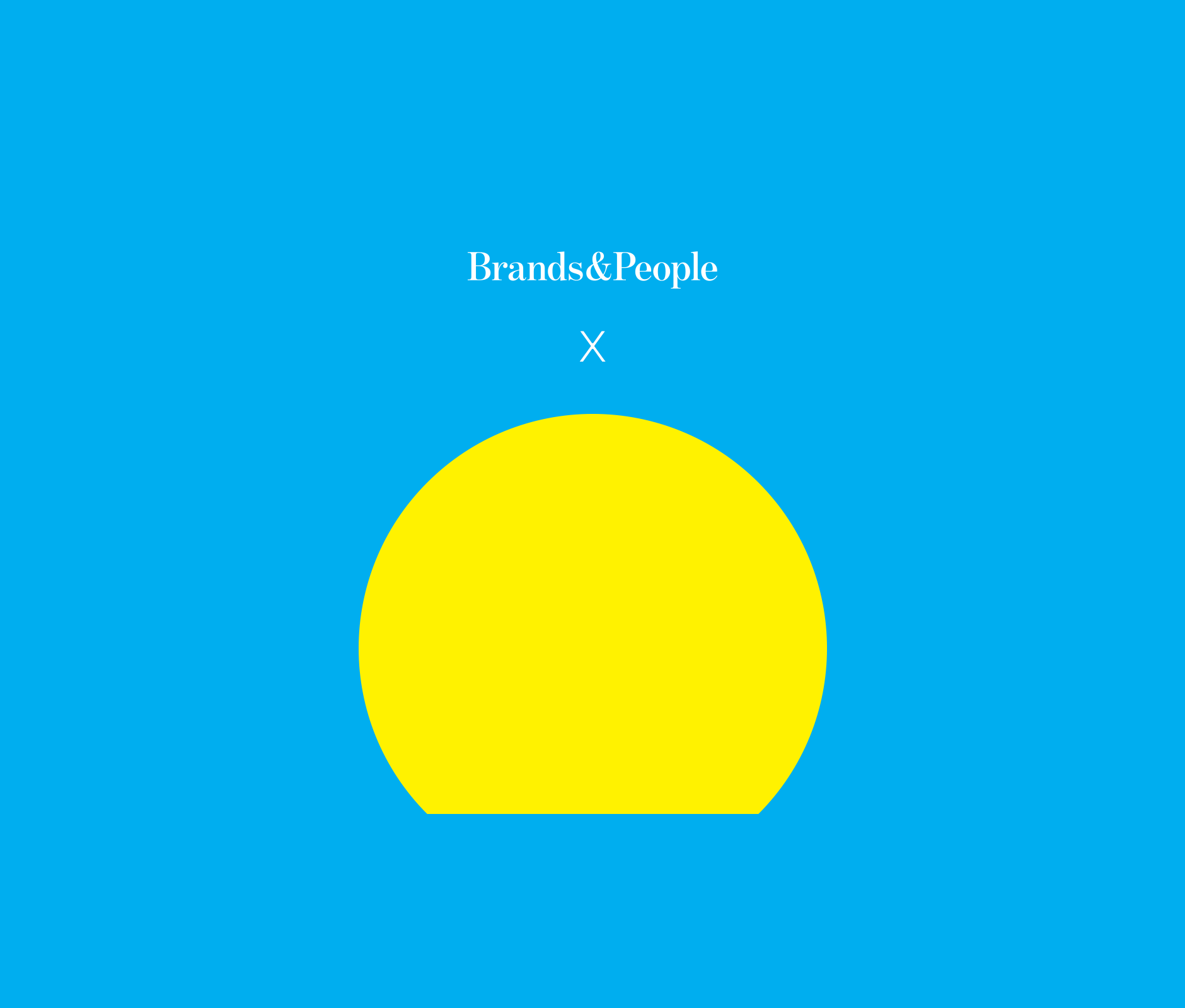
Nuevo Amanecer x Brands&People
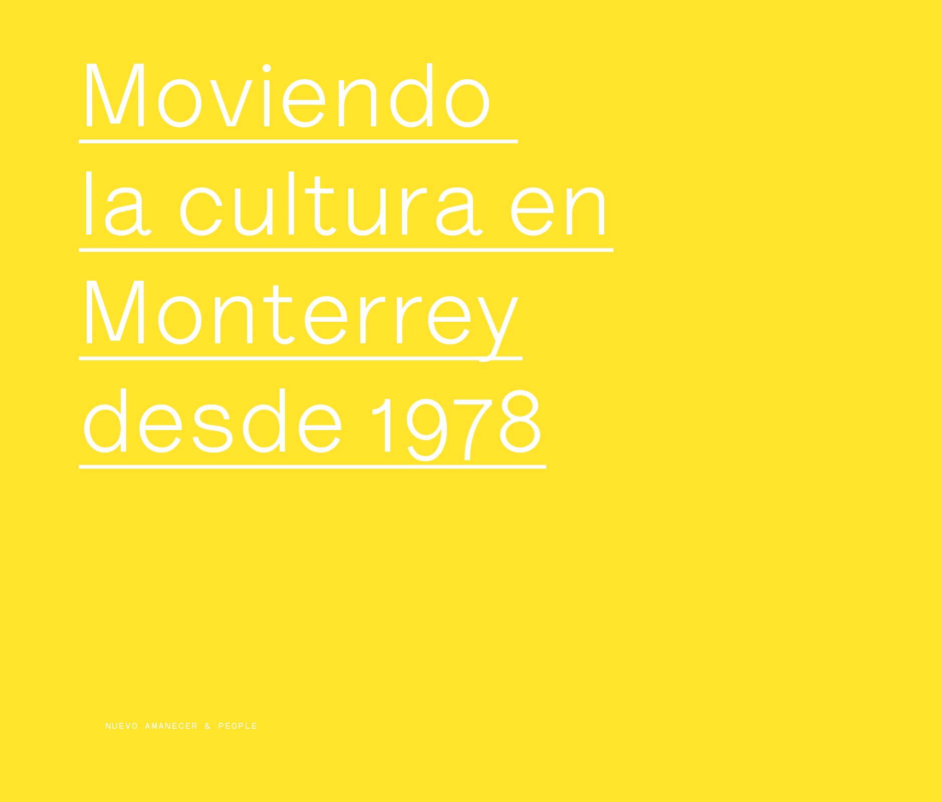
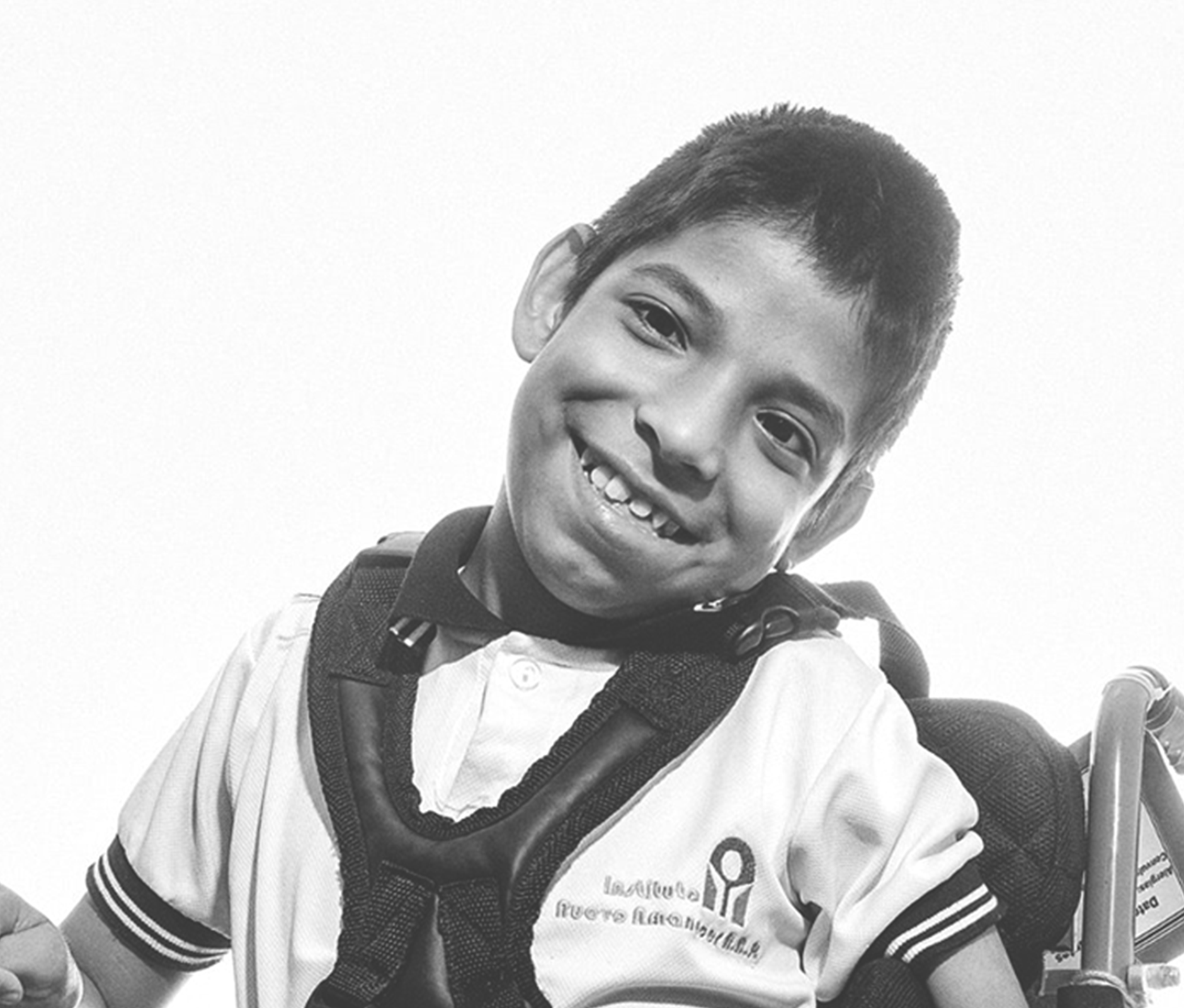
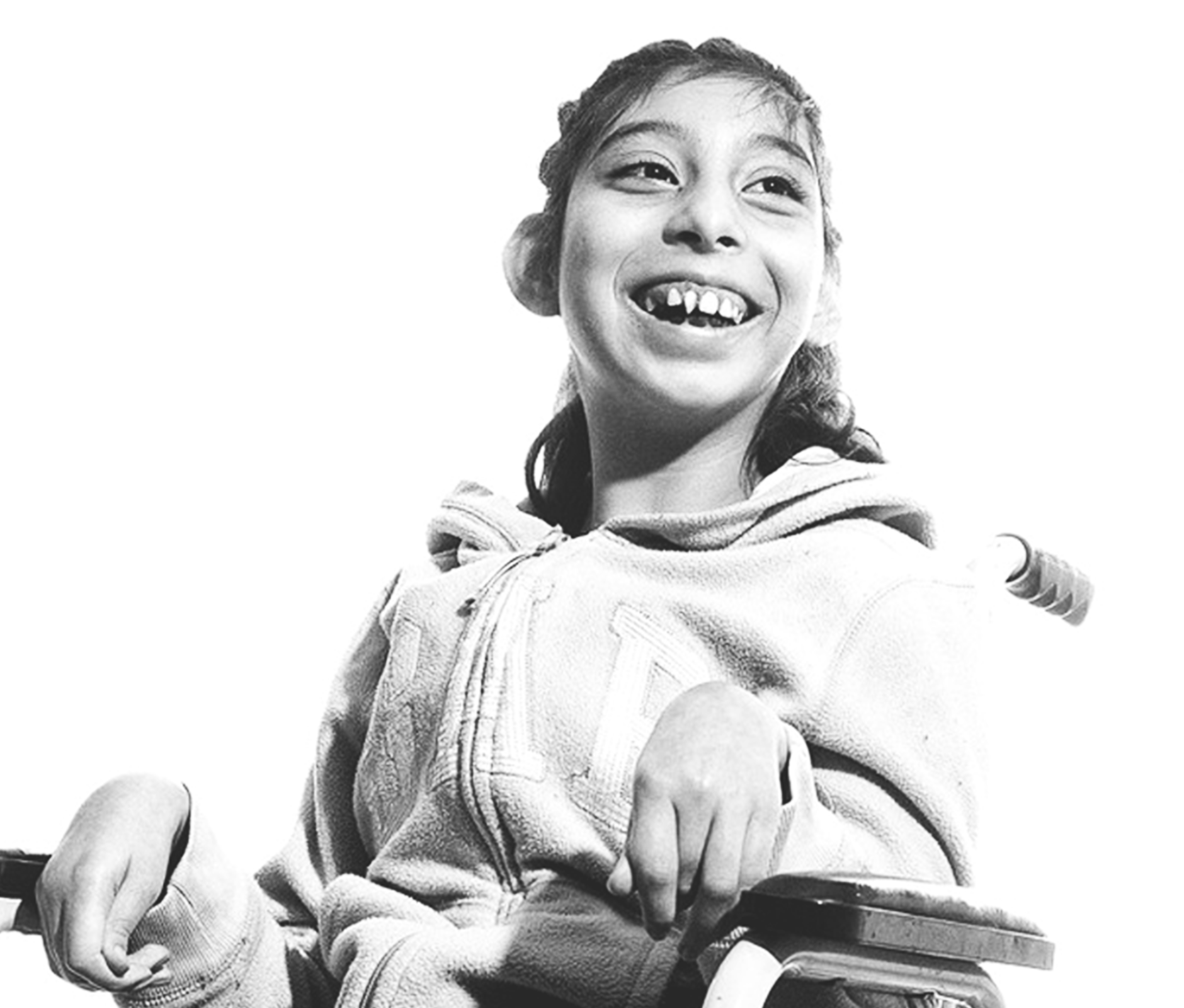
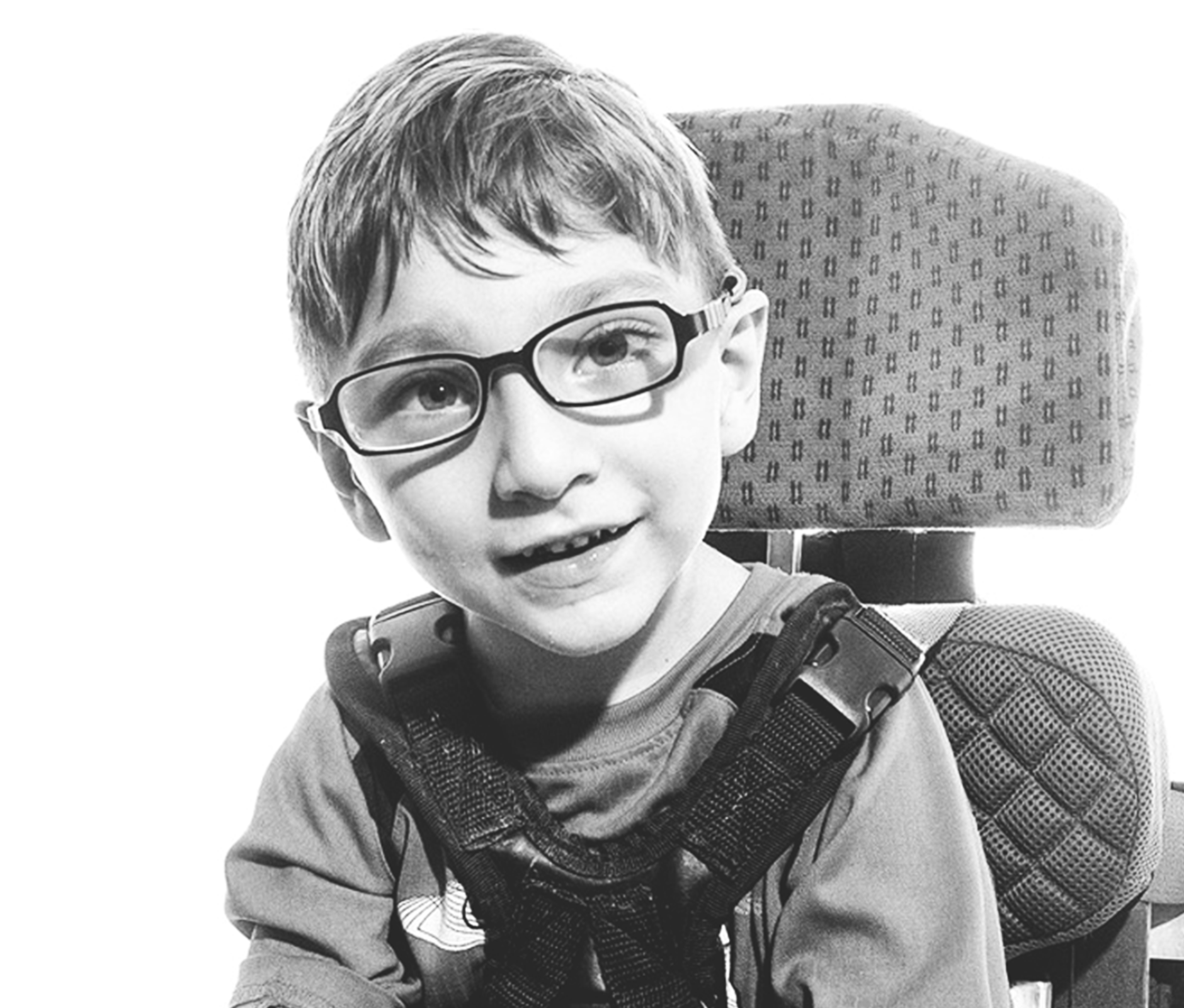
The Nuevo Amanecer Institute is the first cerebral palsy organization in Nuevo Leon. Since 1978, they have helped tens of thousands of families through medical care as well as formative and developmental programs that had opened up better opportunities for more children and young people with cerebral palsy to lead fuller lives and be recognized as valued members of the community.
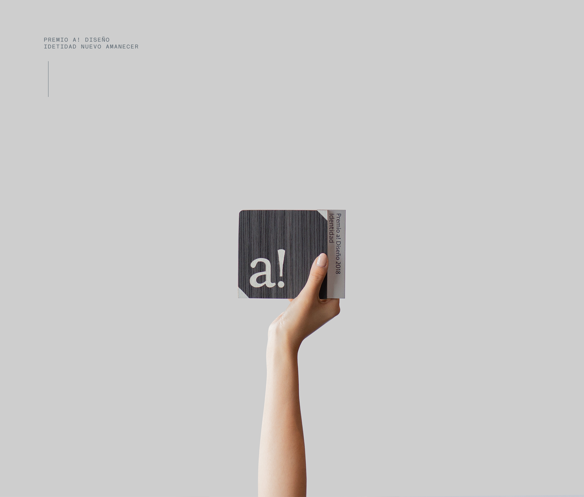
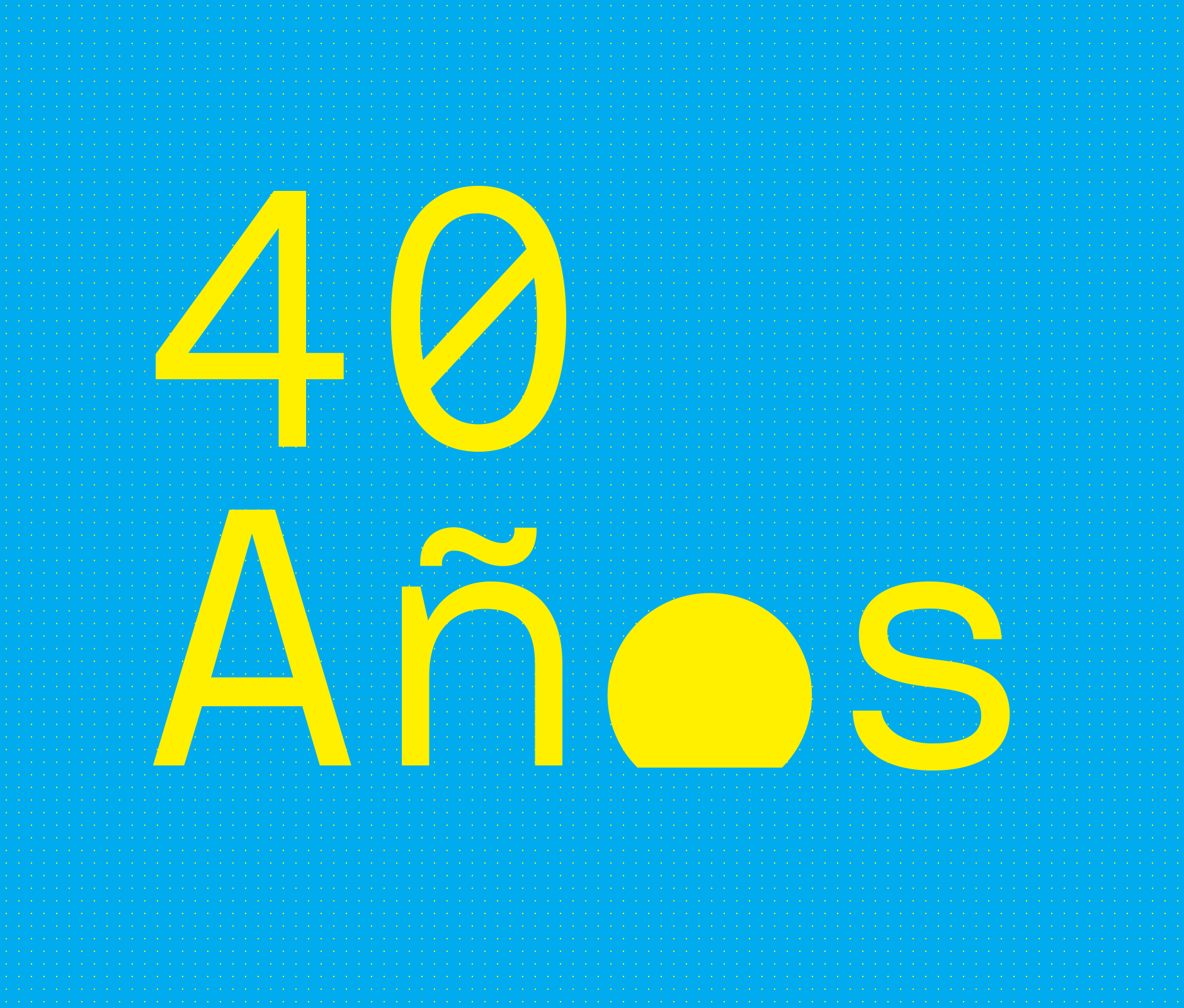
With its 40th anniversary approaching, they commissioned Brands&People to refresh its brand identity and develop a communication strategy, powerful enough to mobilize the local culture around this cause.
New Dawn, New Identity
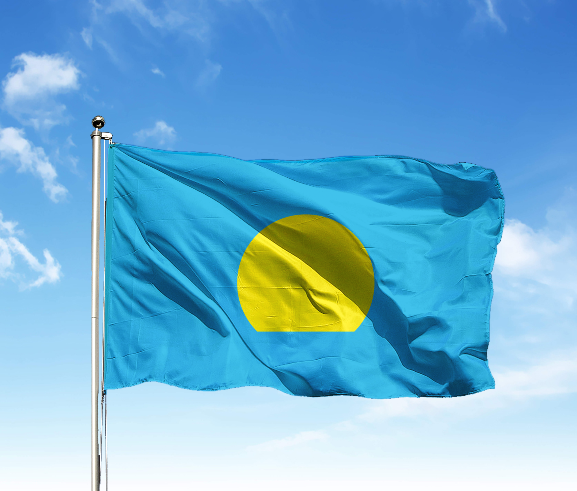
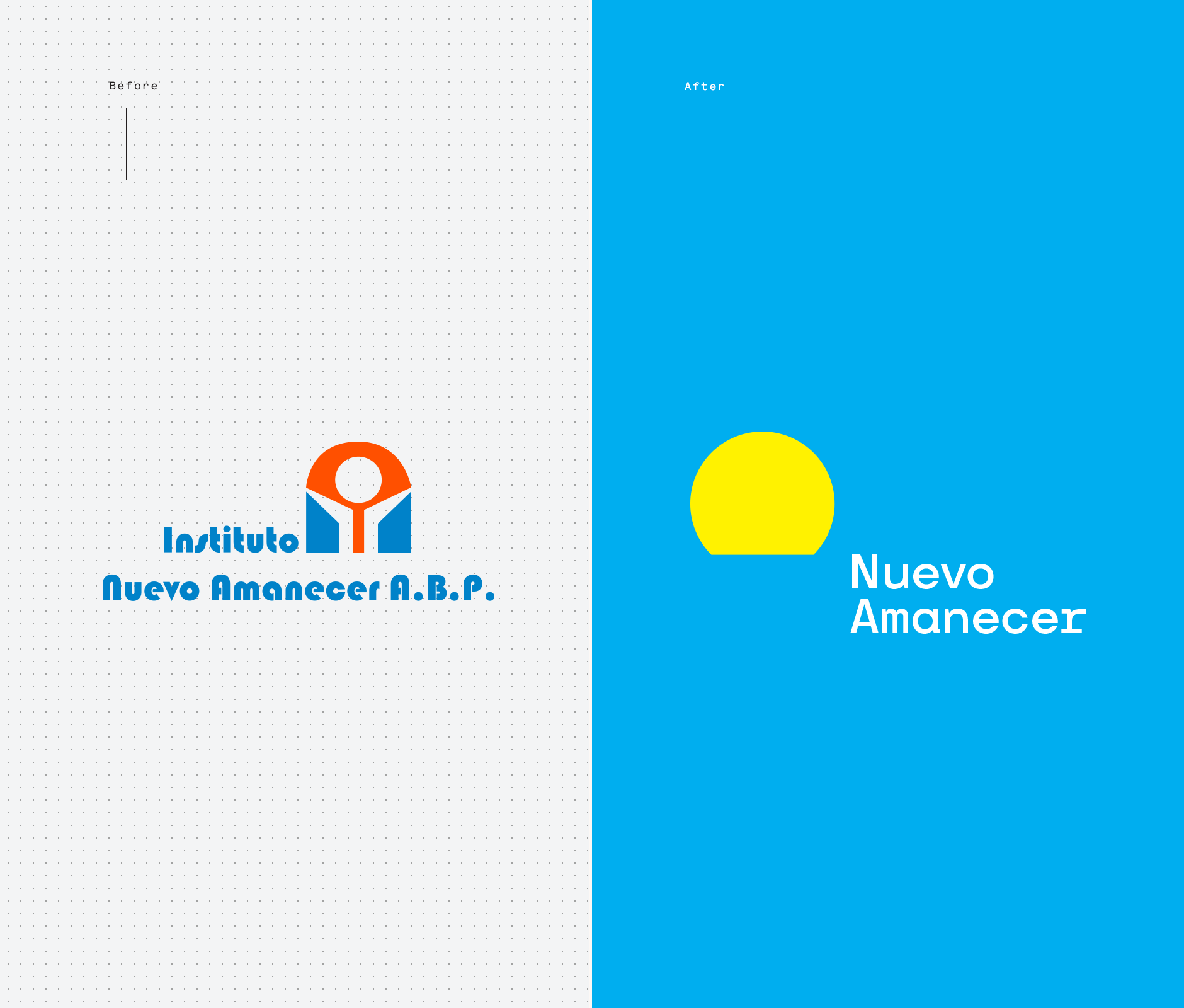
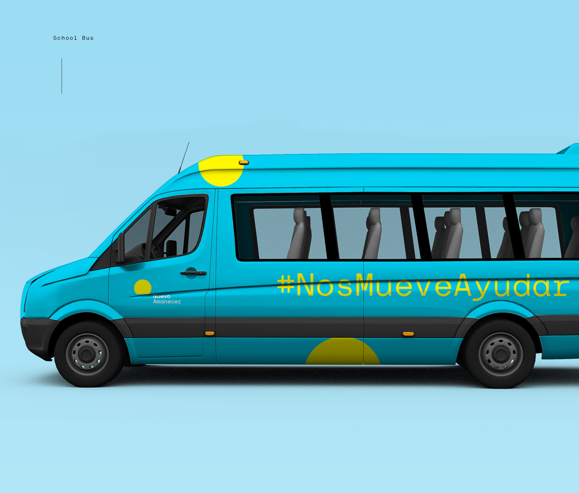
We believe that every movement needs a symbol that represents it. We designed one with formal vehemence and timeless geometry. Simple but unmistakable: the sun. This symbol represents the energy, light, warmth and hope that define the work and beliefs of this organization. In addition, the sun opens up a common ground since it's an image that most of us share when we think of a new day.
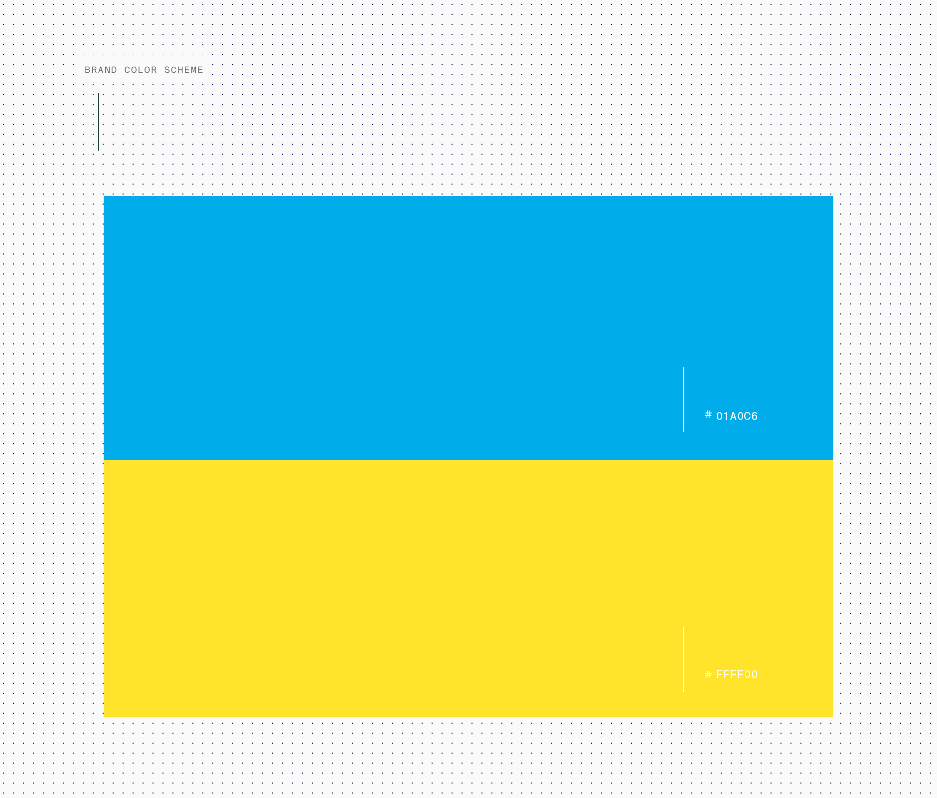
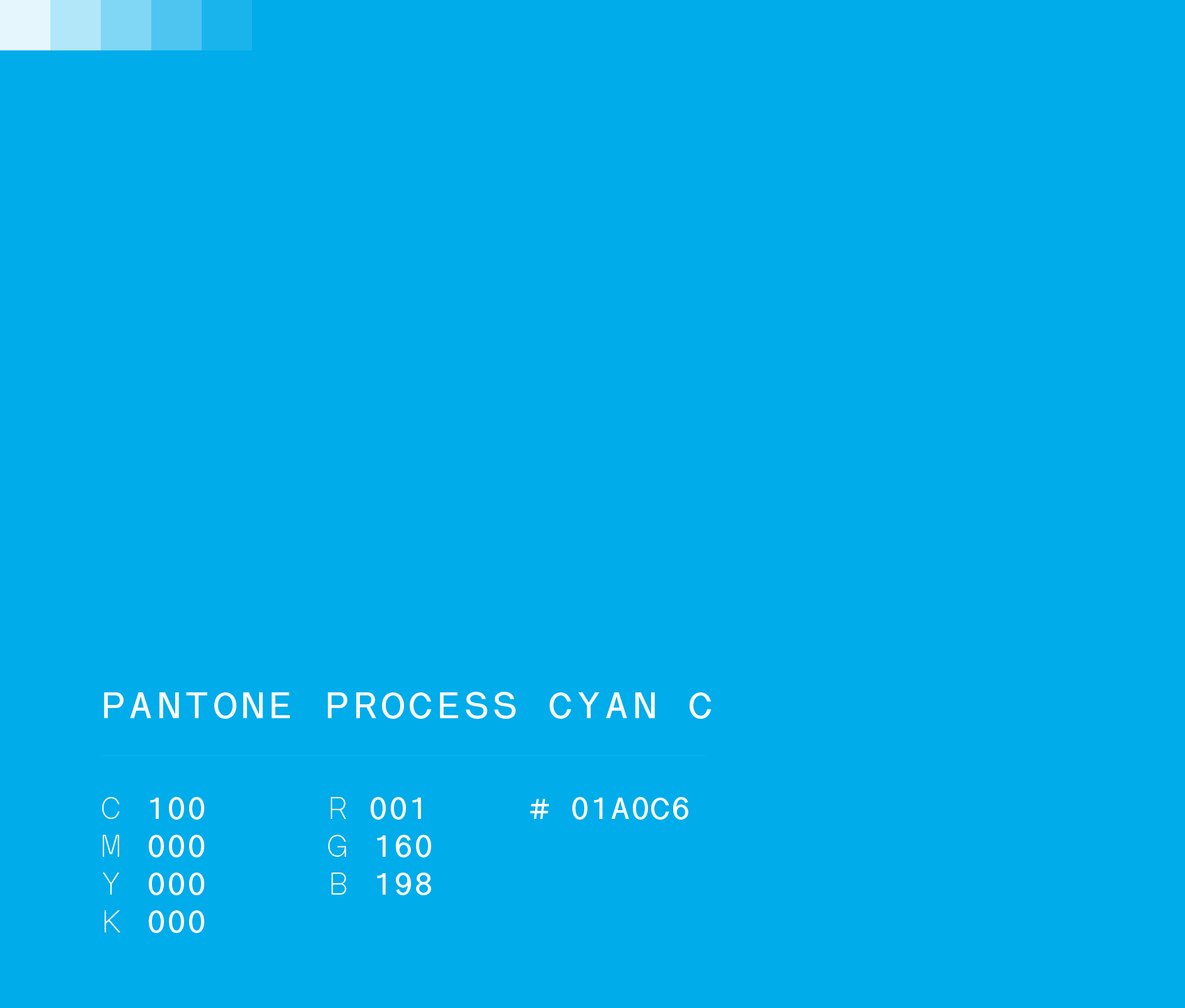
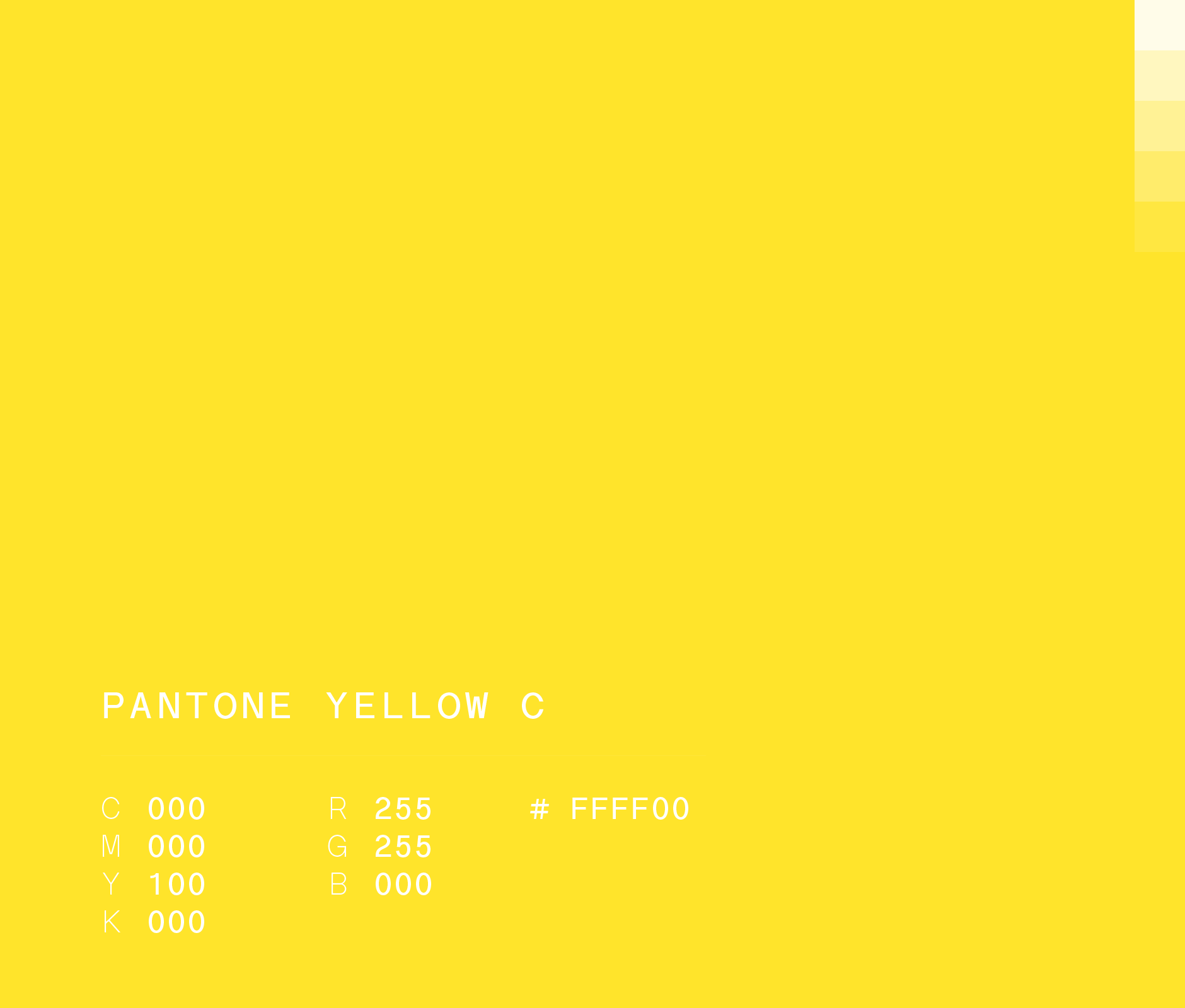
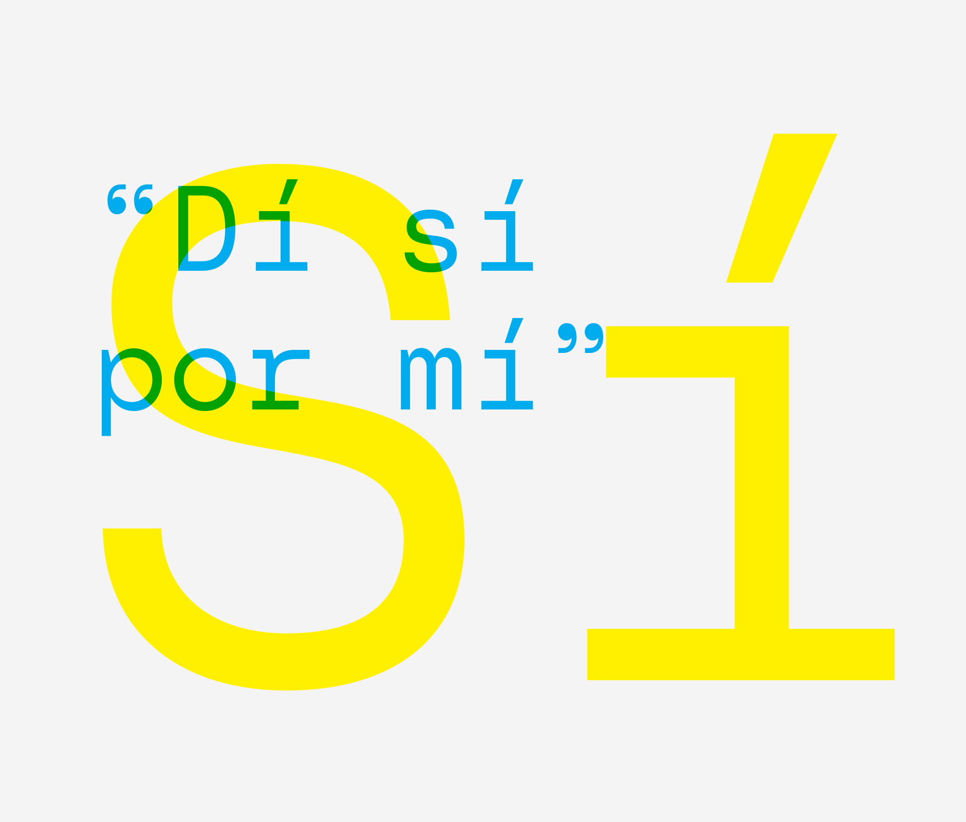
To inject the brand with vivacity, we chose a duo of bright colors. Blue and yellow. Two primary colors that come together at the same level, always hand in hand, complementing each other.
ENG / ESP
Nuevo Amanecer
Un Nuevo Movimiento
Nuevo Amanecer x Brands&People
El Instituto Nuevo Amanecer es la primera organización que atiende la parálisis cerebral en Nuevo León.
Desde su fundación en 1978, han impactando a decenas de miles de familias a través de atención médica así como programas educativos y de desarrollo, abriendo oportunidades para que más niños y jóvenes con parálisis cerebral lleven una vida plena y sean reconocidos como parte valiosa de la comunidad.
En el marco de su 40 aniversario, comisionaron a Brands&People el rediseño de su identidad y el desarrollo de una estrategia de comunicación capaz de movilizar la cultura local alrededor de esta causa.
Nuevo Amancer, Nueva Identidad
Creemos que todo movimiento necesita un símbolo que lo represente. Diseñamos uno con contundencia formal y geometría atemporal. Simple pero inconfundible: el sol. Este símbolo representa la energía, luz, calidez y esperanza que definen la labor y creencias de la organización. Además, abre un territorio en común ya que es una imagen que la mayoría compartimos cuando pensamos en un amanecer.
Para inyectar vivacidad a la personalidad del instituto, elegimos un dúo de colores brillantes. Azul y amarillo. Dos colores primarios que se unen en un mismo plano, van siempre de la mano y se complementan.

ENG / ESP
--
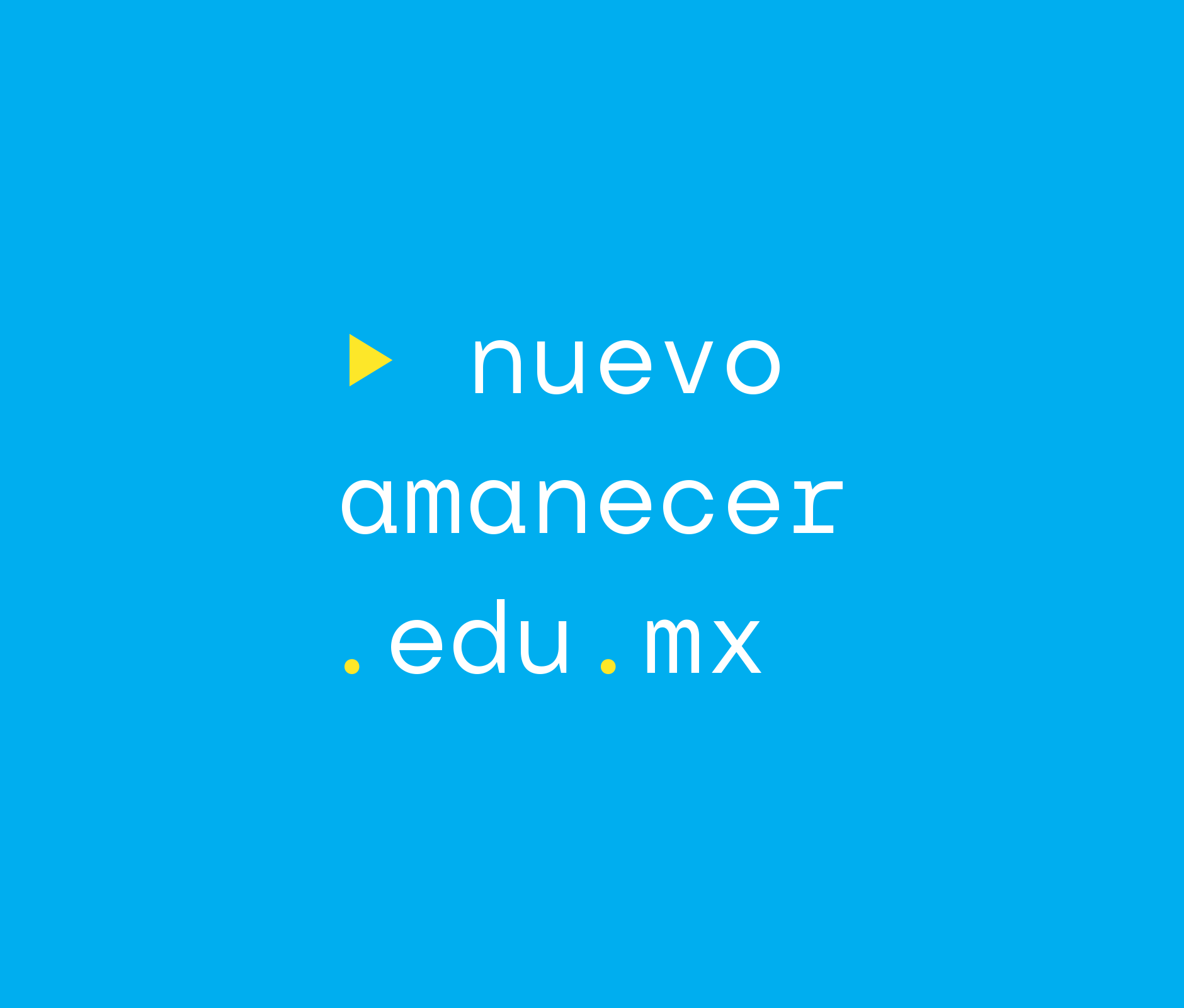
To help the institute regain its relevance, we stopped calling it an institute. We decided to simply shorten it to Nuevo Amanecer. This is how we hope to get it out of its physical space and turn it into a bigger movement, into a topic that belongs to everyone.
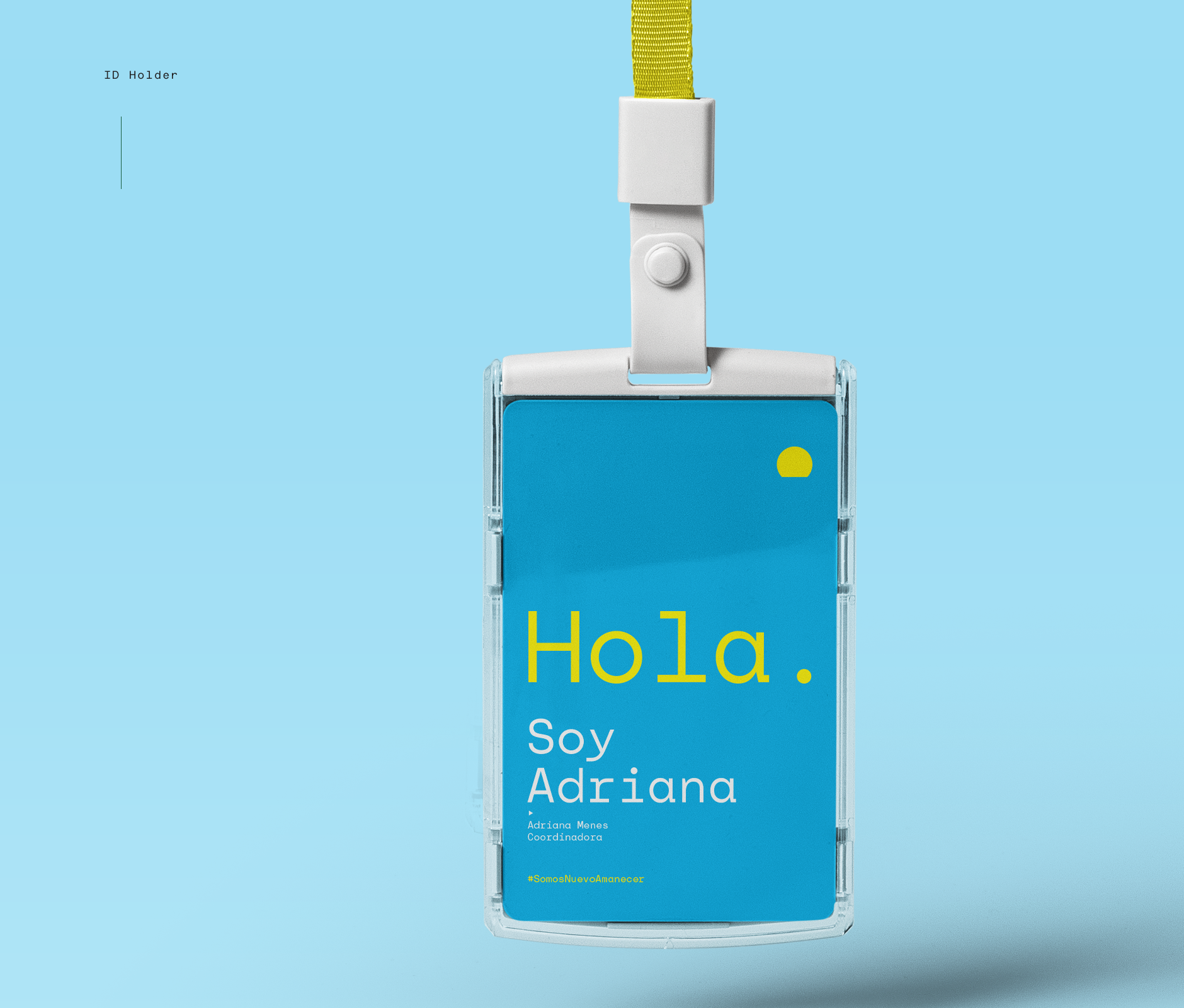
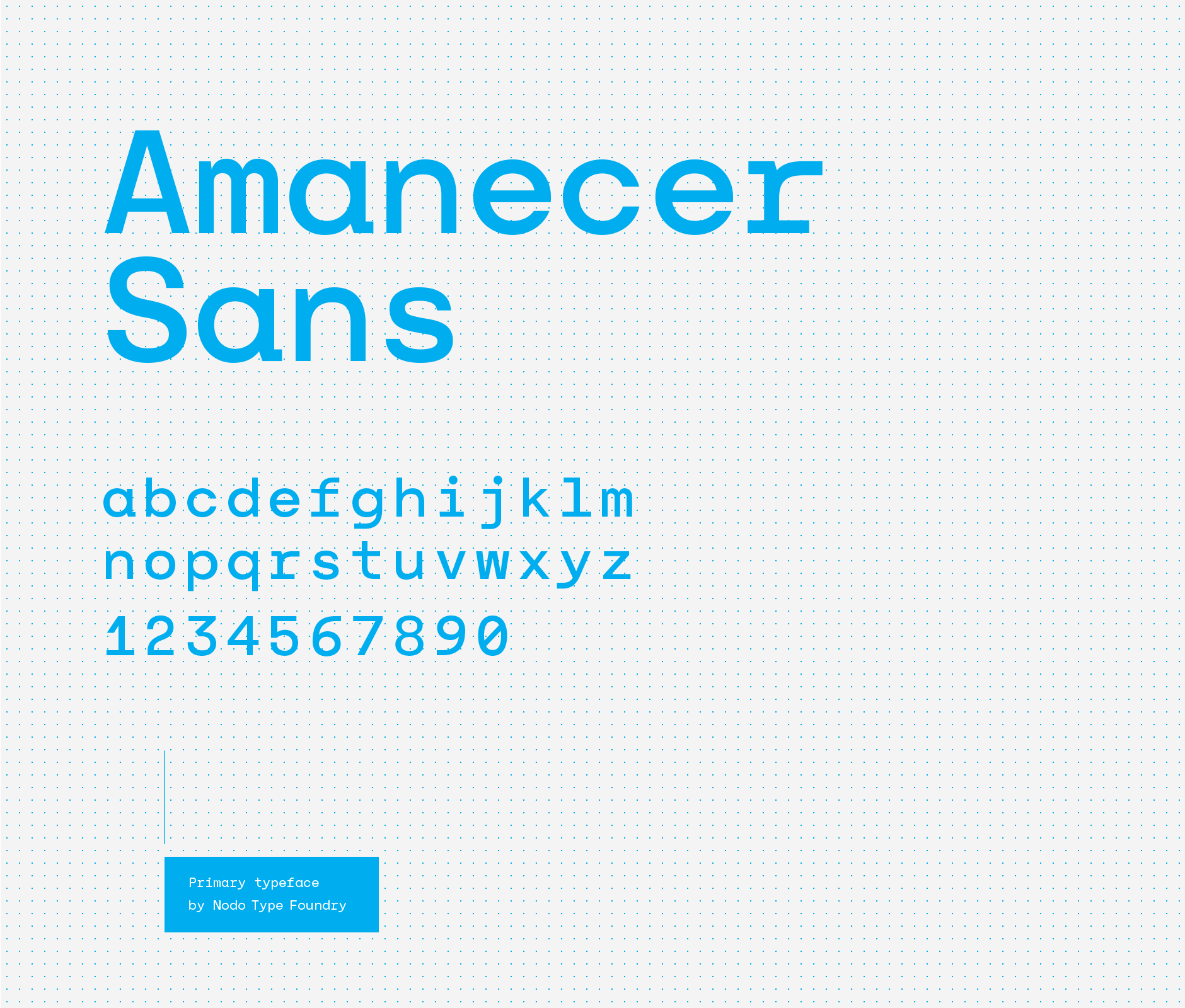
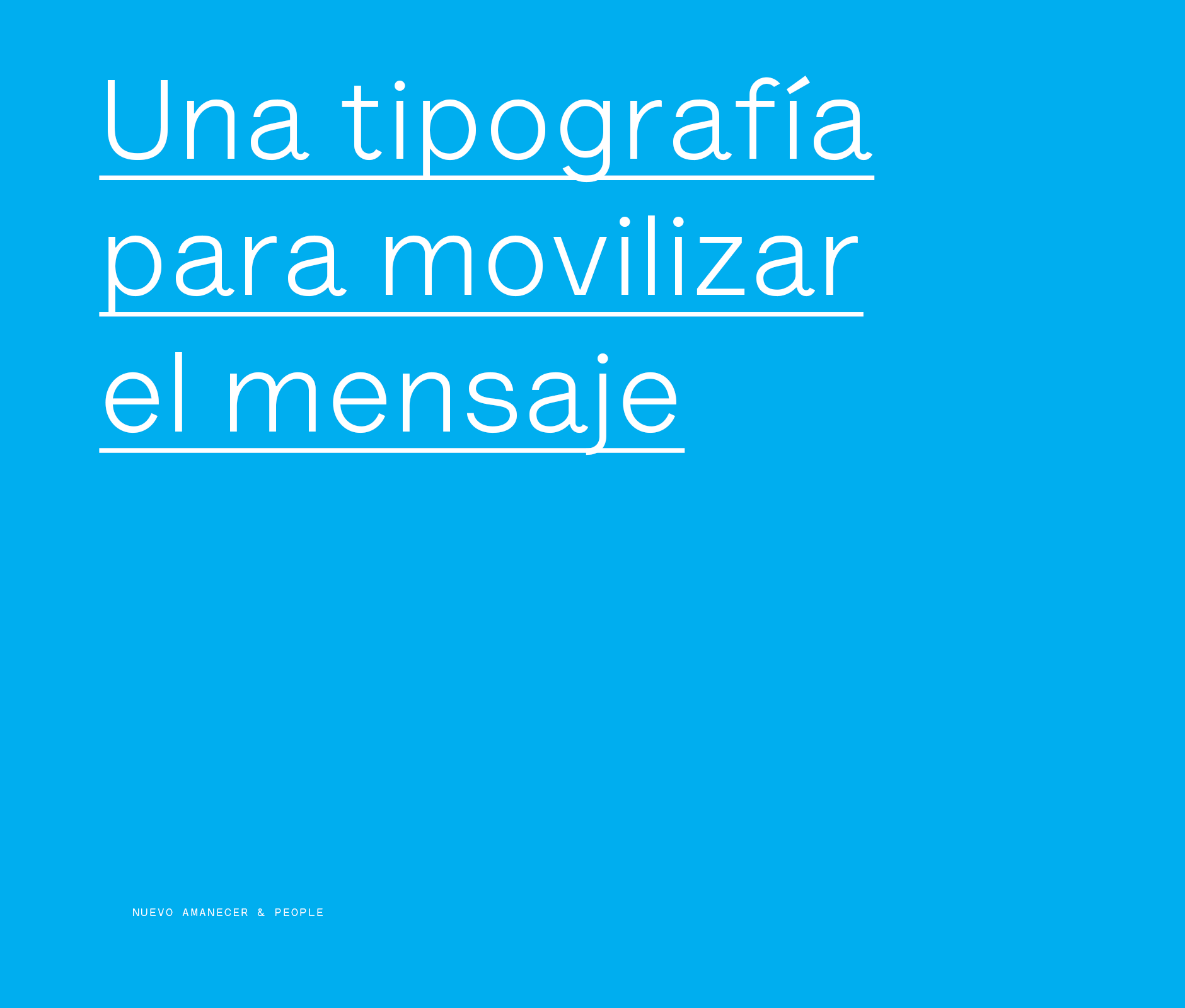
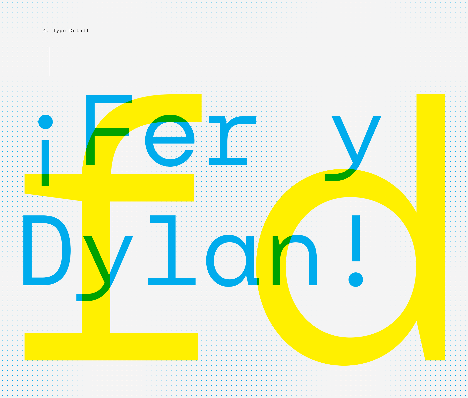
We complemented the identity with a custom typeface donated by Nodo Type Foundry with elemental traces that allows the brand to extend its message and reduce the distance between people and cerebral palsy while speaking to each student, each family and each person that is willing to help create a more inclusive society.
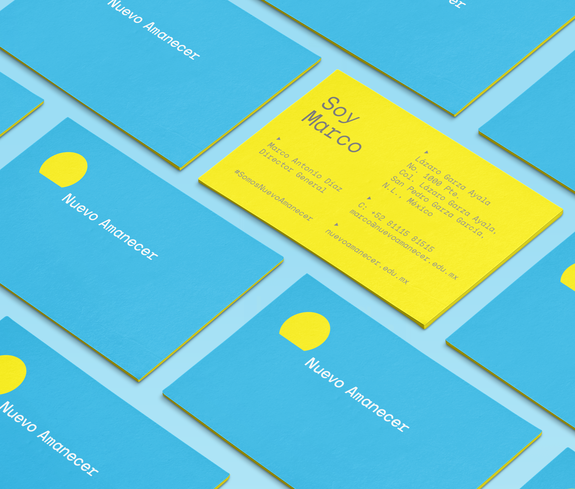
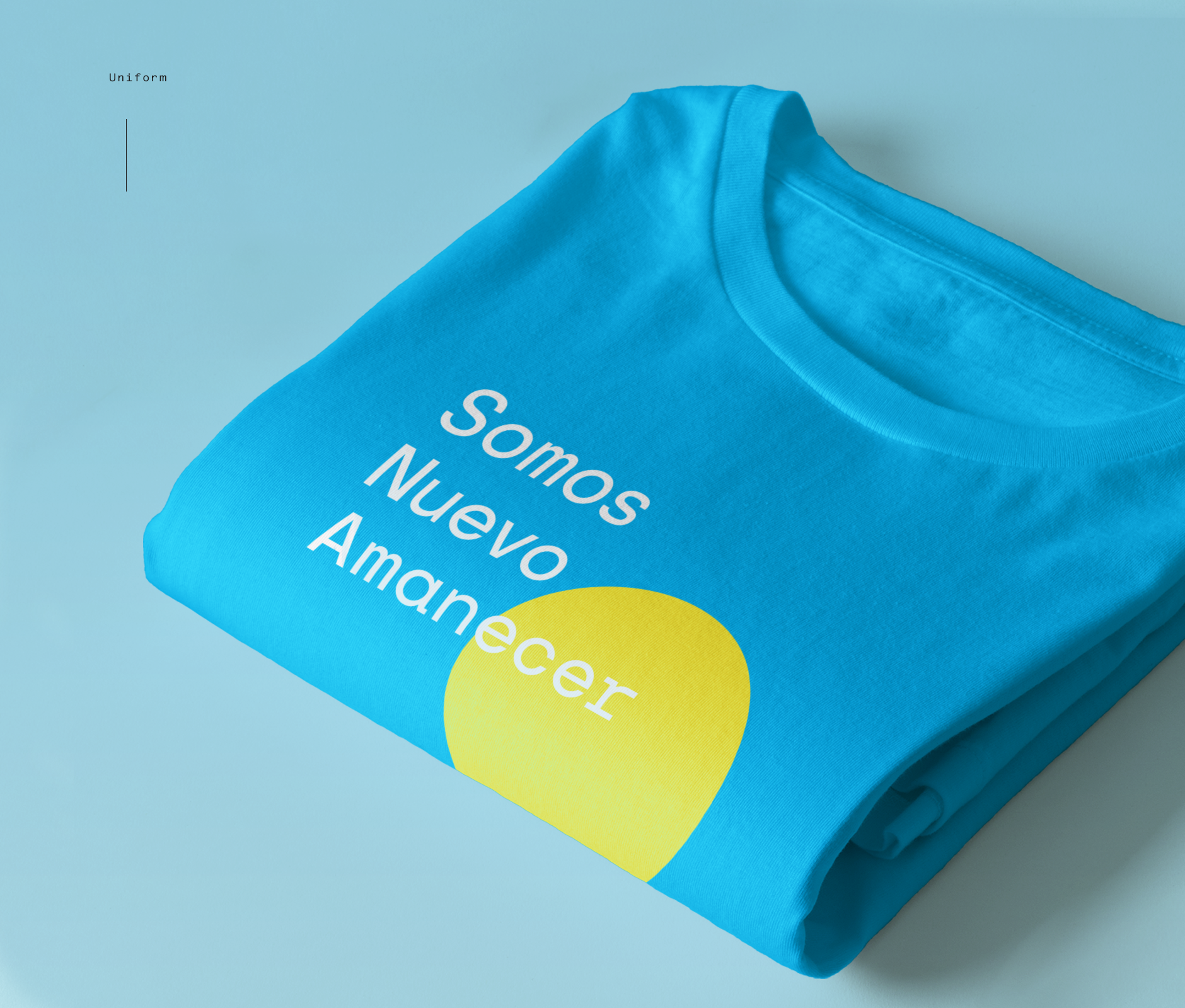
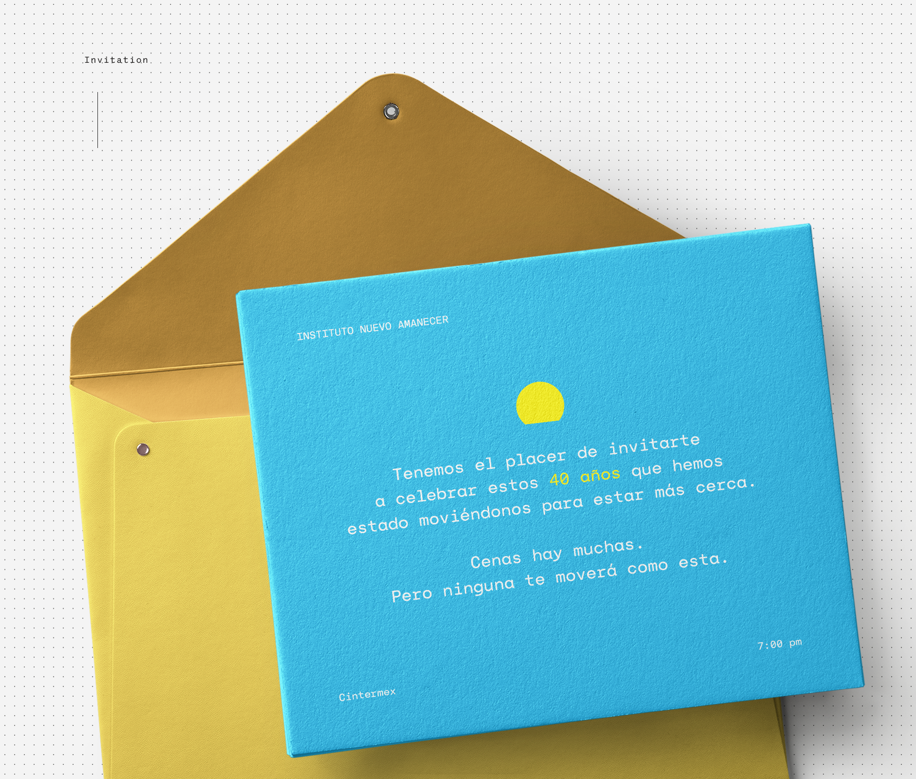
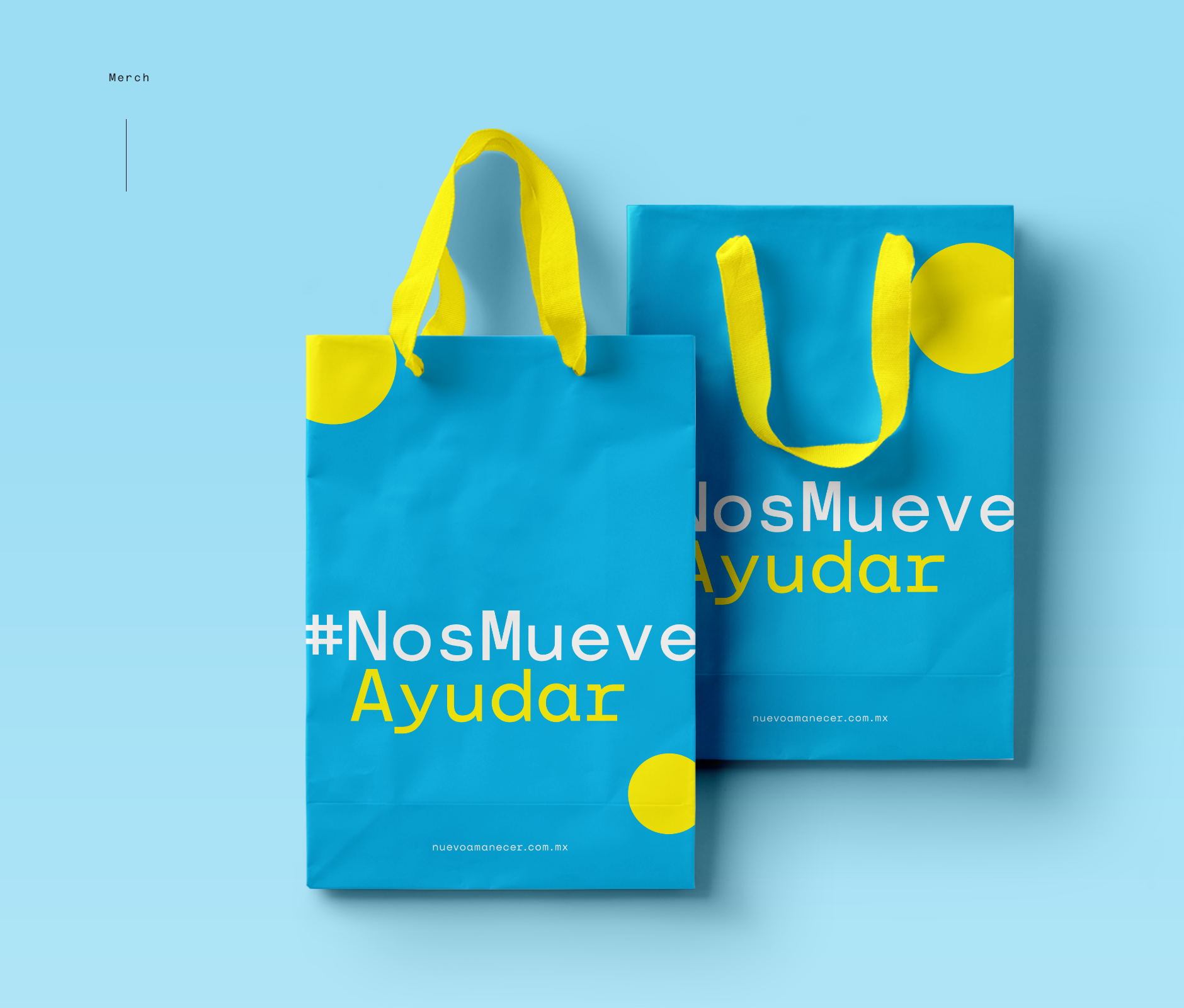
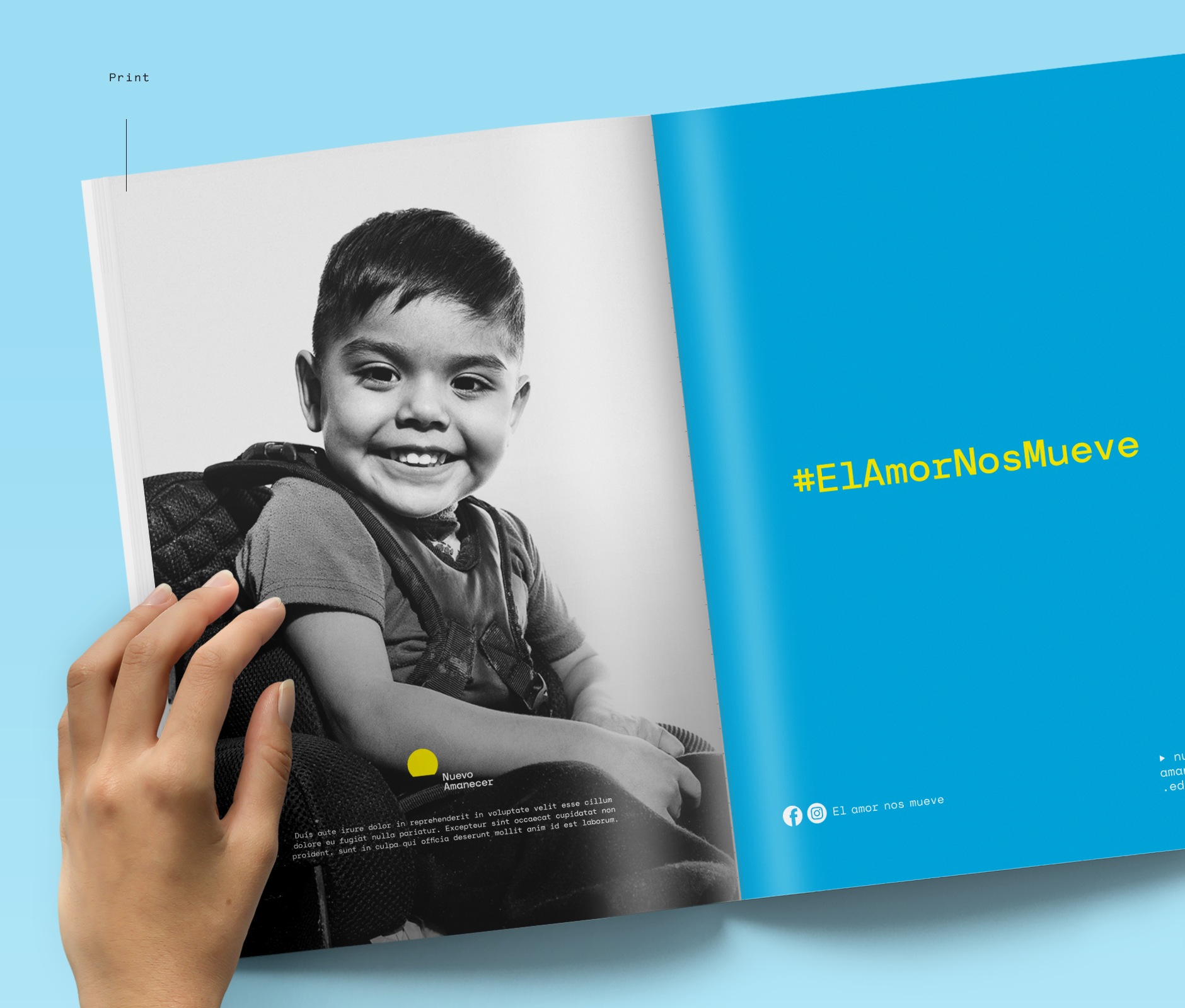
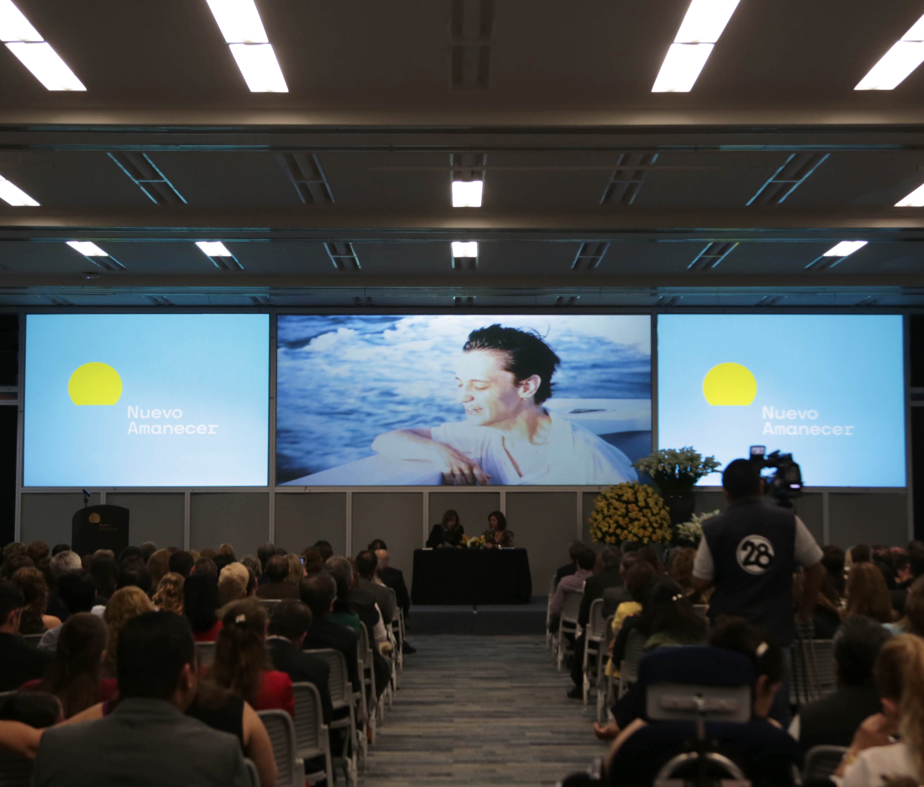
We deployed this identity throughout different media and formats, from stationery and communication materials to the institute's facilities.
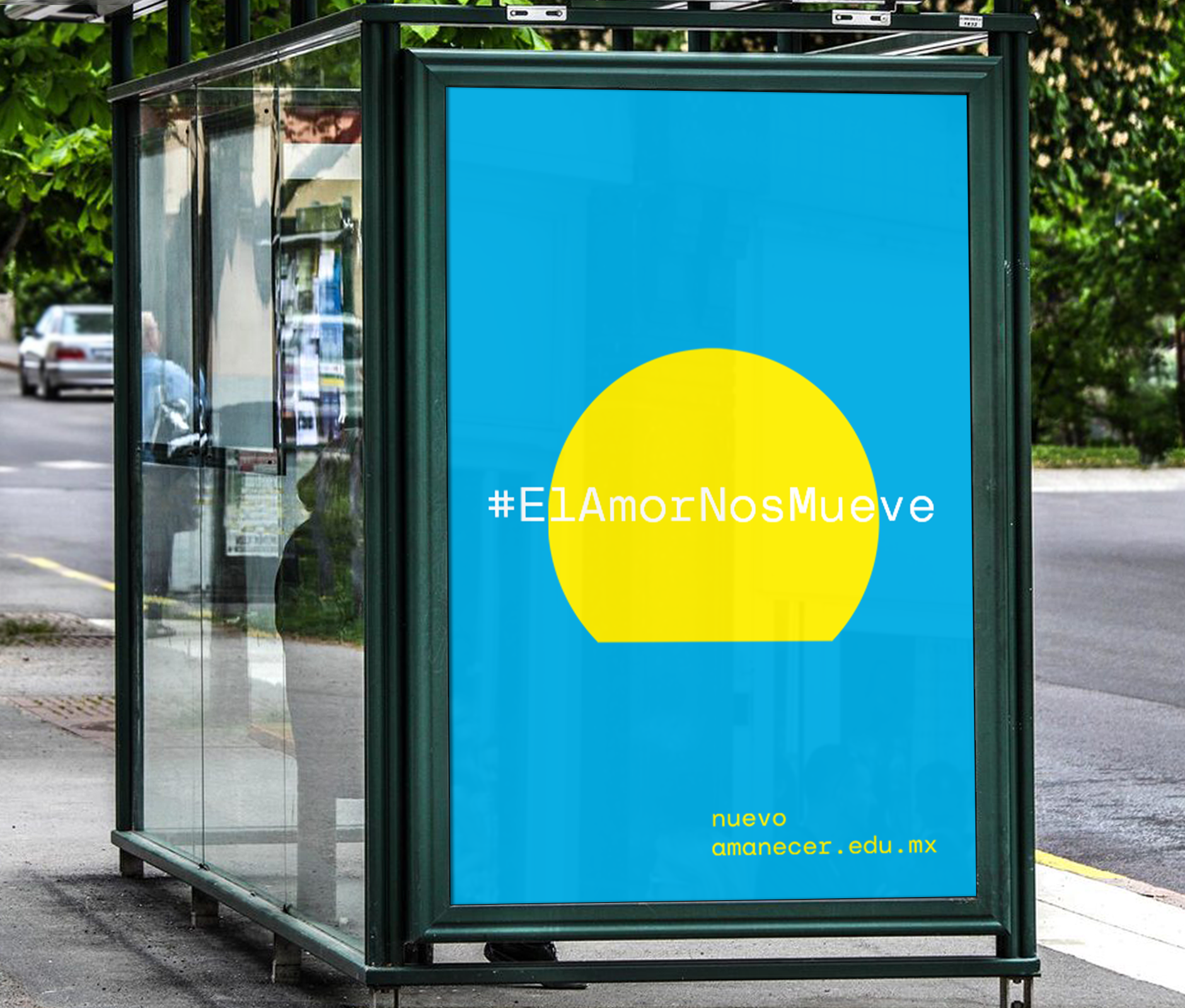
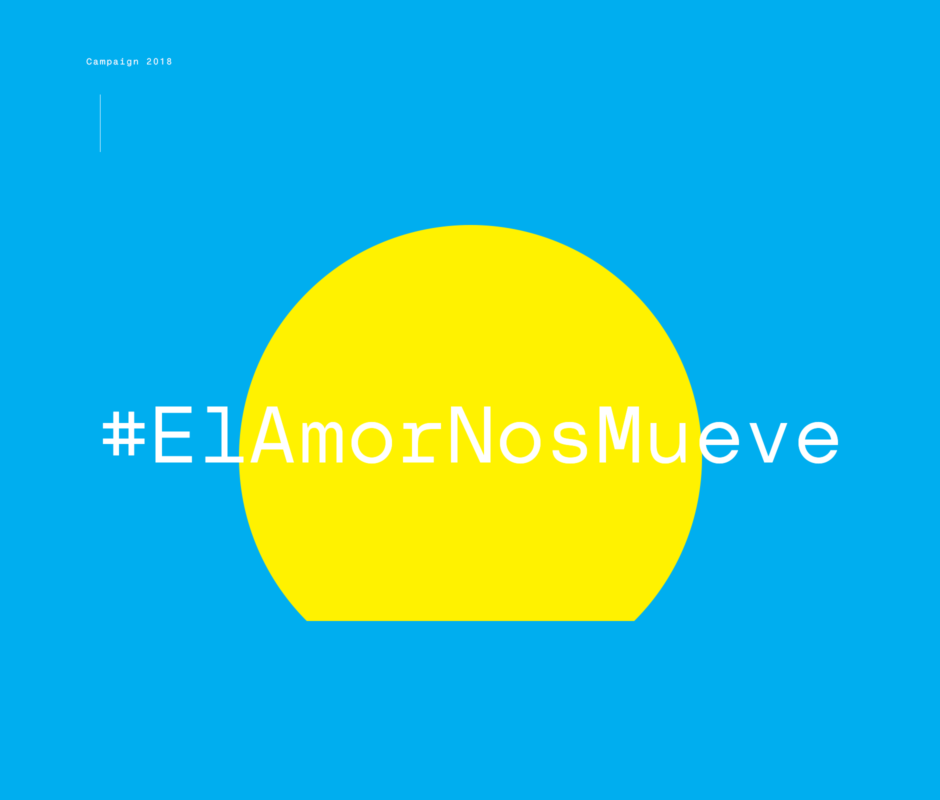
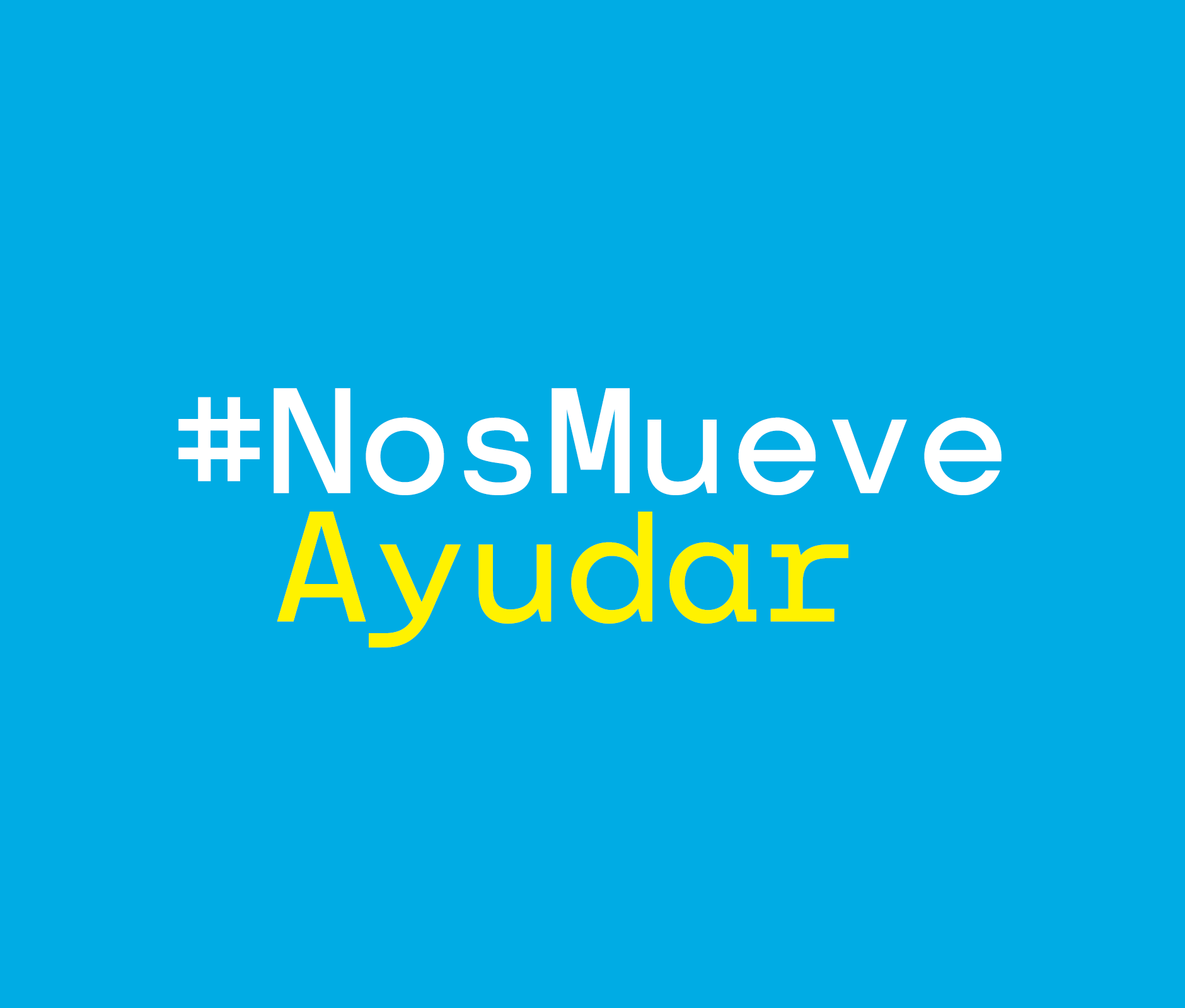
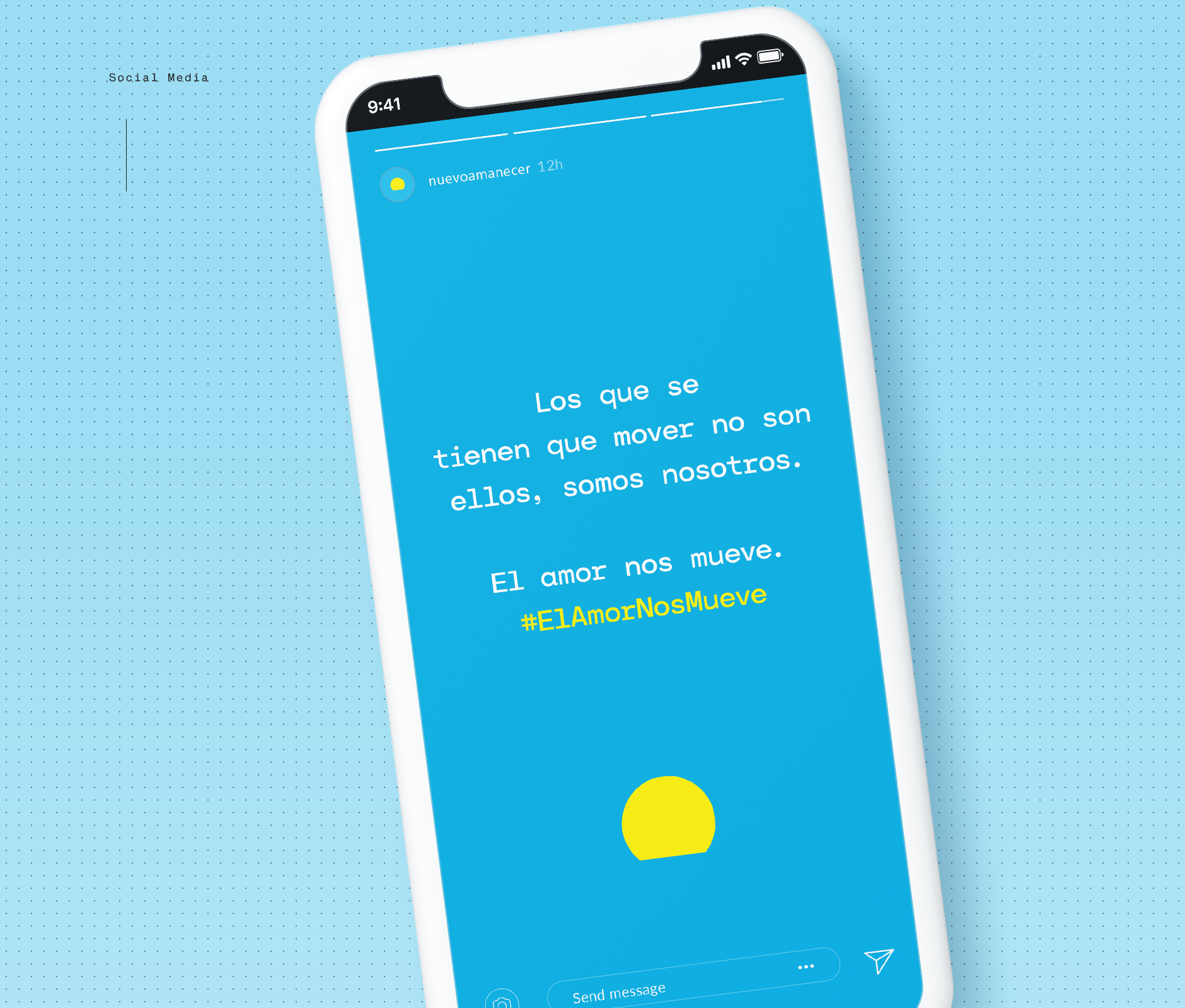
Soon, we will launch the #elamornosmueve brand campaign, bringing our fresh new emblem and message to the entire state.
Also, to share this cause and get more people involved, we will invite other educational, art and design institutions to collaborate with Nuevo Amanecer in creating art installations and objects powerful enough to mobilize minds and hearts.
In general, we hope to ignite new conversations around cerebral palsy, so more people get closer to Nuevo Amanecer and are moved to learn about their work, resulting in much brighter futures for even more students and their families.
ENG / ESP
--
Para que el instituto recobre su relevancia, dejamos de llamarlo instituto. Decidimos acortarlo simplemente a Nuevo Amanecer. Así lo sacamos del espacio físico y lo convertimos en un movimiento más grande, en un tópico que es de todos.
Complementamos la identidad con una tipografía donada por Nodo Type Foundry con rasgos contemporáneos que permite a la marca extender su mensaje y acortar la distancia entre las personas y la parálisis cerebral, hablándole a cada alumno, a cada familia y a cada persona que busca ayudar a crear una sociedad cada vez más inclusiva.
Desplegamos esta identidad para que viva en diversos medios y formatos, desde la papelería interna y materiales de comunicación hasta las instalaciones del instituto.
Próximamente, lanzaremos la campaña de marca #elamornosmueve, llevando nuestro emblema y mensaje a todo el estado.
También con el objetivo de compartir esta causa e involucrar a más personas, invitaremos a colaborar a otras instituciones educativas, de arte y diseño para que a su vez creen instalaciones y objetos capaces de movilizar conciencias y corazones.
En general, esperamos encender nuevas conversaciones al rededor de la parálisis, para que más personas se acerquen al Nuevo Amanecer y conozcan su trabajo, haciendo posible que cada vez más alumnos y sus familias tengan acceso a futuros más brillantes.
ENG / ESP
Nuevo Amanecer x Brands&People
Marco, Lily, Emmanuel, Veronica, Gerardo,
Aldo, Marcela, Adriana, Fani, Juanjo
A brand vision
by Emmanuel Moreau and Gerardo Ortiz
co-founders at B&P
Co-create
Collaborate
Connect
B&P
ENG / ESP
Nuevo Amanecer x Brands&People
Marco, Lily, Emmanuel, Veronica, Gerardo,
Aldo, Marcela, Adriana, Fani, Juanjo
A brand vision
by Emmanuel Moreau and Gerardo Ortiz
co-founders at B&P
Co-create
Collaborate
Connect
B&P