Brand&People
ENG / ESP
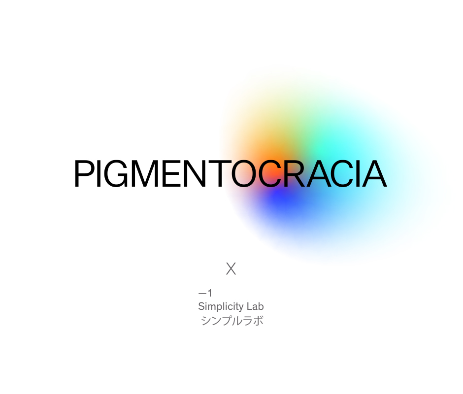
PIGMENTOCRACIA
Transforming Narratives
PIGMENTOCRACIA x Brands&People
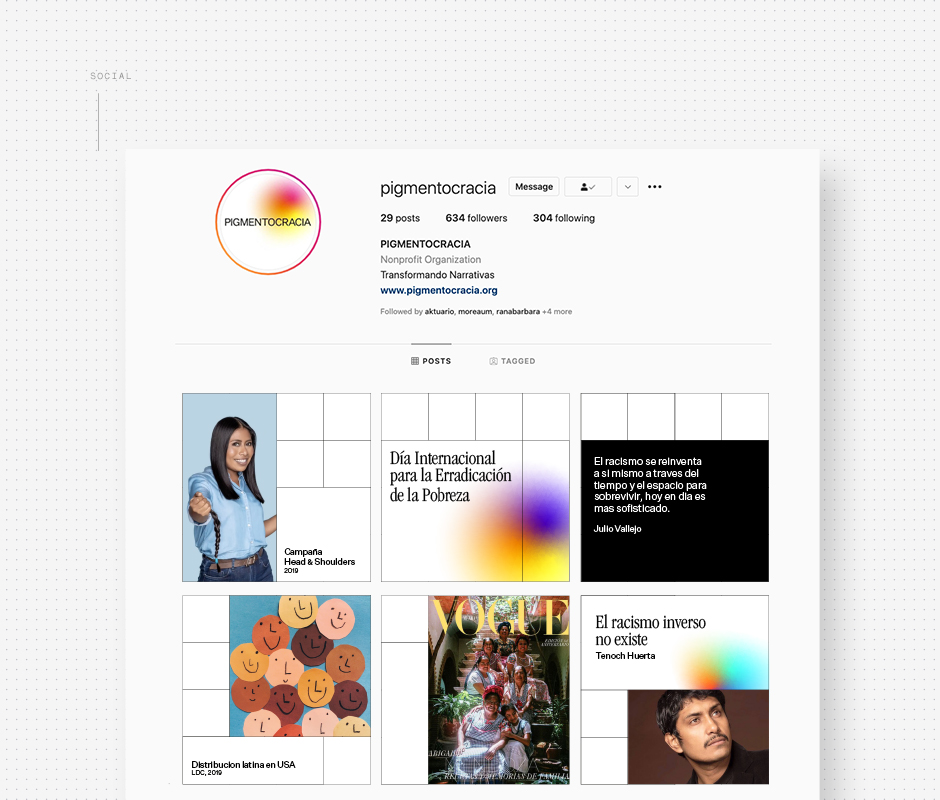
If you haven't heard of Pigmentocracia, allow us to introduce you. A non-profit organization based in L.A. that boosts knowledge and encourages action against racism in advertising. Founder Julio Vallejo seeks to transform the narrative of skin color and assists individuals, projects, and organizations in recognizing and internalizing concepts about race, diversity, and inclusion through knowledge and training within their own cultural context. Their methodology focuses on strategies and actions with a direct impact on the professional environment and media portrayal in front and behind the camera.
Representation
Racism is an issue that has always been relevant, and today more than ever the topic has been owning up to its voice in Mexico. This is why Brands&People said yes to designing Pigmentocracia's new look. It was important to give the brand a face with large power and at the same time a voice neutral enough to encourage change and not be perceived as an organization that's out to judge but to encourage unitedness. Representation is crucial because it shapes how we view society, we should demand more of it instead of avoiding or simplifying our cultures.
ENG / ESP
PIGMENTOCRACIA
Transformando Narrativas
PIGMENTOCRACIA x Brands&People
Si no has oído hablar de Pigmentocracia, permítenos presentarlos. Una organización sin fines de lucro con sede en Los Ángeles que fomenta el conocimiento y la acción contra el racismo en la publicidad. El fundador Julio Vallejo busca transformar la narrativa del color de la piel y ayuda a individuos, proyectos y organizaciones a reconocer e internalizar conceptos sobre raza, diversidad e inclusión a través del conocimiento y la capacitación dentro de su propio contexto cultural. Su metodología se centra en estrategias y acciones con impacto directo en el entorno profesional y la representación delante y detrás de la cámara.
Representación
El racismo es un tema que siempre ha sido relevante, y hoy más que nunca el tema ha tomado visibilidad en México. Es por eso que Brands&People dijo que si a diseñar la nueva identidad de Pigmentocracia. Era importante darle a la marca un rostro con gran poder y, al mismo tiempo, una voz lo suficientemente neutral como para fomentar el cambio y no ser percibida como una organización que juzga. La representación es crucial y debemos exigir más de ella en lugar de evitar o simplificar nuestras culturas e historias.


ENG / ESP
Type
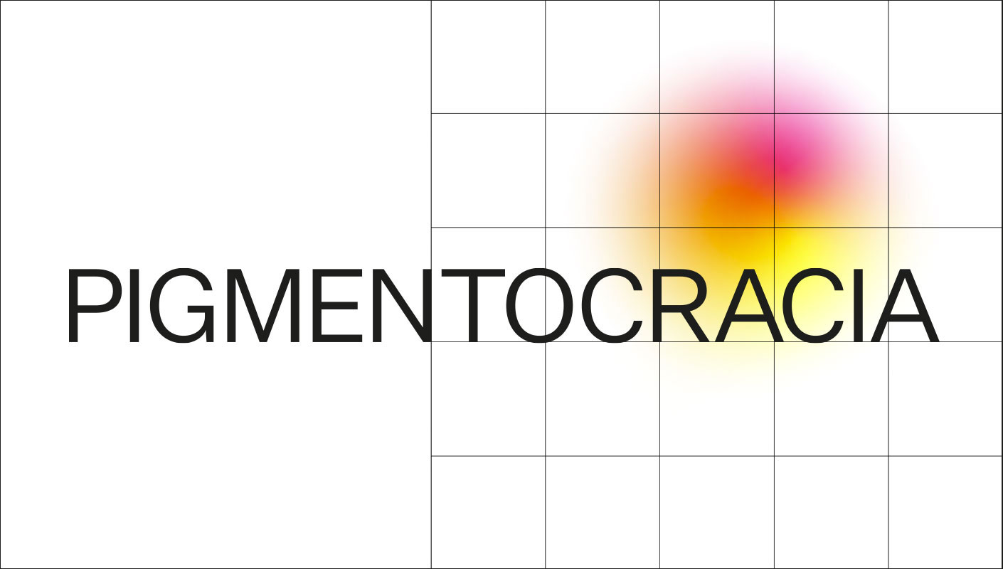
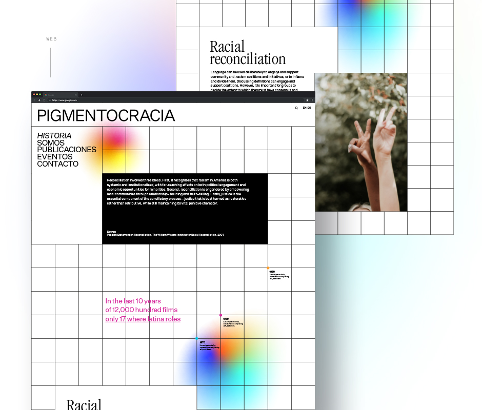
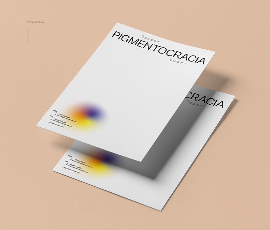
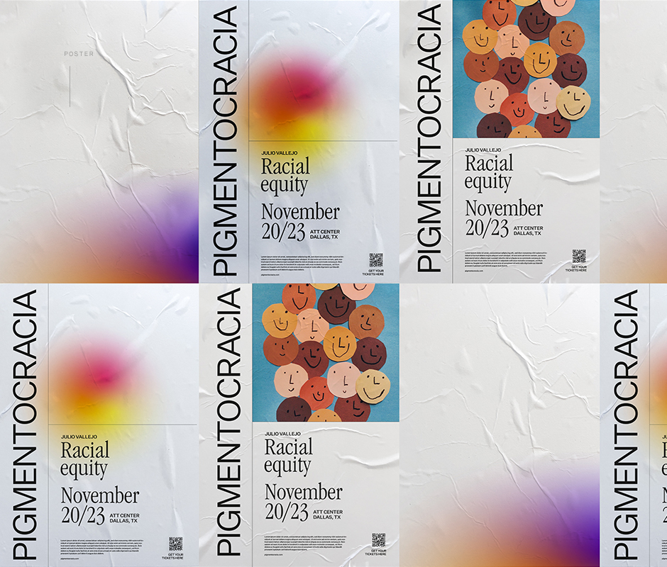
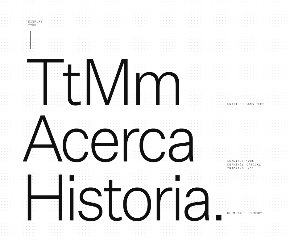
The word Pigmentocracia holds a lot of narrative itself, pigment from Latin 'pigmentum' meaning to paint and the Greek 'kratos' meaning power or rule. This is why the decision was made not to place any additional elements as isotypes that could dissolve the conversation when the word itself is already complicated enough. Pigmentocracia was purposely designed with a neutral, legible, simple typeface; in black. The purpose behind the type was for it to not have a visual association to skin and could leave it all in the name.
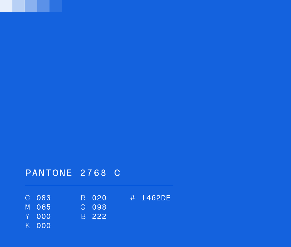
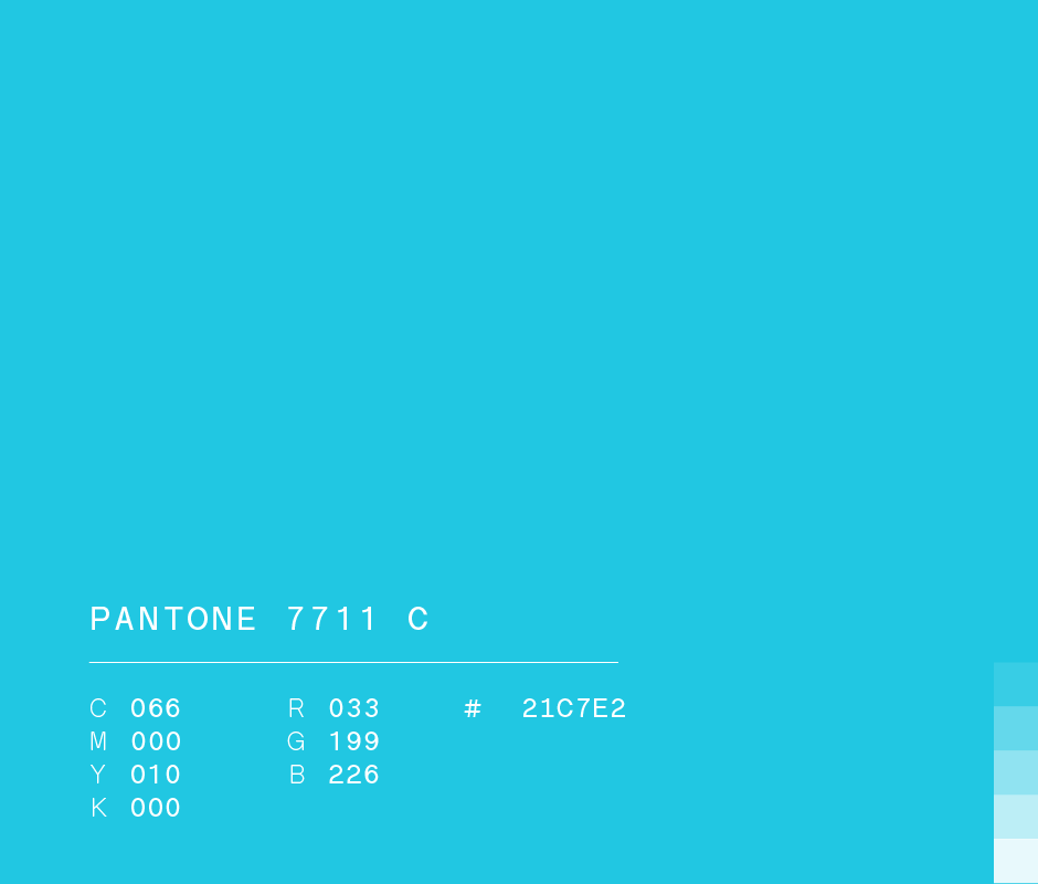
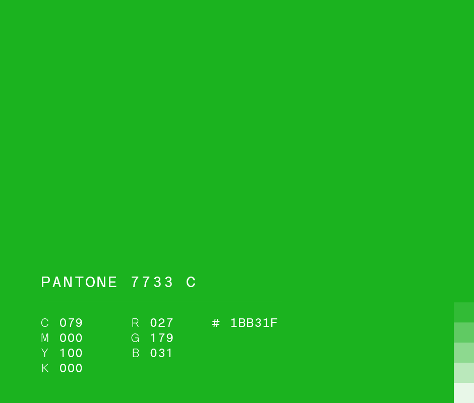
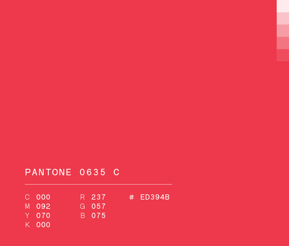
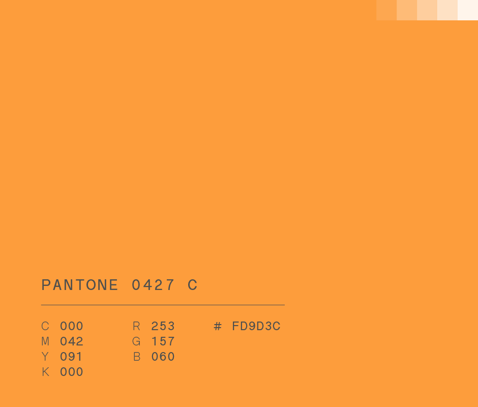
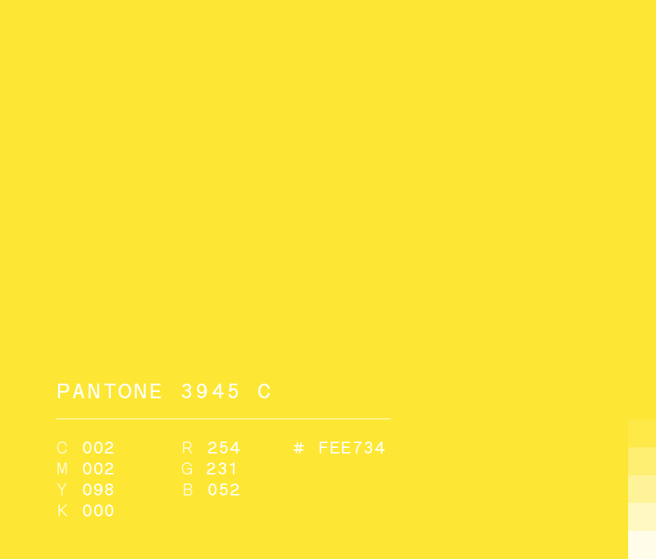
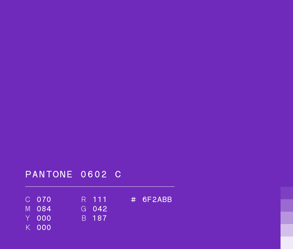
Colors
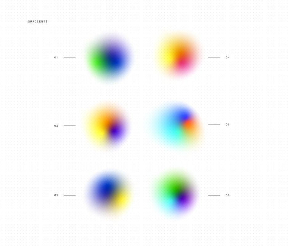
3 primary colors exist. An infinite amount of combinations can be mixed out of the 3, each color with its own essence. This analogy reminds us that just like all these pigments are capable of intertwining and performing together, we too can apply the same perspective concerning our diversity. The identity was complemented with a vibrant color palette that spans different shades from each other to be able to talk about differences. In the same way, gradients were created to make reference to ourselves and state that each combination makes us incomparable.
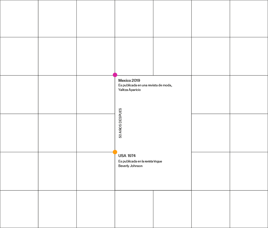
82%
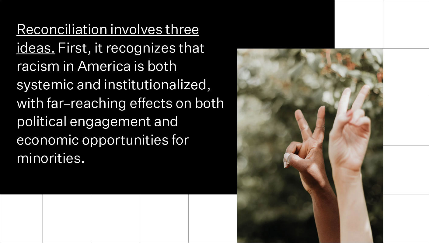
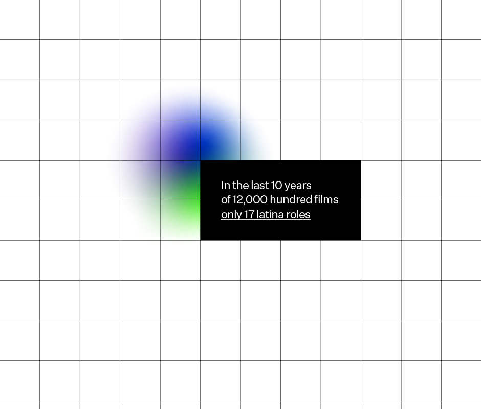
Did you know that 82% of the advertising in Mexico's magazines is made up of light-skinned characters? Ironically, 88%of the people in Mexico identify as having brown or dark skin. We are systematically incentivized to hold an unconscious bias towards skin color, and there's an opportunity here to change this by making the choice of becoming conscious.
ENG / ESP
Tipografía
La palabra Pigmentocracia tiene mucha narrativa en sí misma, pigmento del latín 'pigmentum' que significa pintar y el griego 'kratos' que significa poder. Es por eso que se tomó la decisión de no colocar ningún elemento adicional como isotipos que pudieran disolver la conversación cuando la palabra en sí ya es lo suficientemente robusta. Pigmentocracia se diseñó con una tipografía neutra, legible, simple. La idea detrás de ella era que no tuviera ninguna asociación visual con la piel y pudiera dejarlo todo en el nombre.
Colores
Existen 3 colores primarios. Se puede mezclar una cantidad infinita de combinaciones de los 3, cada color con su propia esencia. Esta analogía nos recuerda que así como todos estos pigmentos son capaces de entrelazarse y actuar juntos, nosotros también podemos aplicar la misma perspectiva con respecto a nuestra diversidad. La identidad se complementa con una paleta de colores vibrantes que abarca diferentes tonos entre sí para poder hablar sobre las diferencias. De la misma forma, se hicieron degradados haciendo referencia a nosotros mismos y afirmando que cada combinación nos hace incomparables.
82%
¿Sabías que el 82% de la publicidad en las revistas de México está compuesta por personajes de piel clara? Irónicamente, el 88% de las personas en México se perciben a sí mismas como hombres o mujeres de piel morena u oscura. Se nos incentiva sistemáticamente a mantener un sesgo inconsciente hacia el color de la piel, y aquí existe la oportunidad de cambiar esto volviéndonos conscientes.


ENG / ESP
People
Pigmentocracia x Brands&People
2020
Gerardo. Mel. Ale.
A brand vision
by Emmanuel Moreau and Gerardo Ortiz
co-founders at B&P
Co-create
Collaborate
Connect
B&P
ENG / ESP
People
Pigmentocracia x Brands&People
2020
Gerardo. Mel. Ale.
A brand vision
by Emmanuel Moreau and Gerardo Ortiz
co-founders at B&P
Co-create
Collaborate
Connect
B&P