Brand&People
ENG / ESP
Banregio
new identity
new energy
Brands&People x Banregio
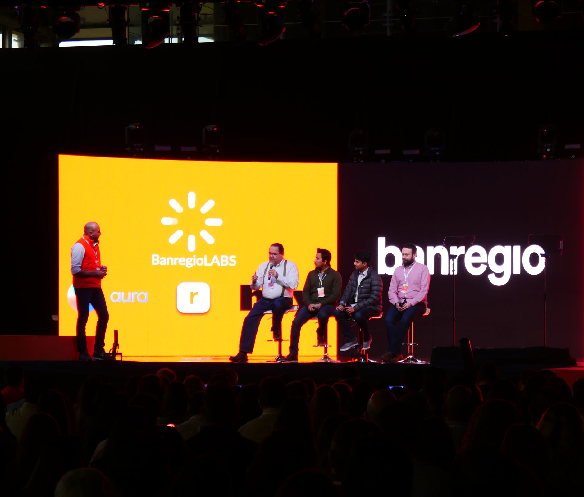
We love the co-creative partnership we have with Banregio. And we love their story. Born in 1994, during one of the most difficult financial times in our country’s history, this dynamic bank has thrived while boosting businesses, shattering conventions and simplifying financial services for everyone.
Since launching our partnership with Banregio in 2016, we have focused on showing exactly what this innovative financial institution is all about. Working from bottom to top, we targeted the core of their strategic communications throughout all their products and services, giving the brand a refreshingly irreverent voice while helping them build on a proactive show-don’t-tell approach.
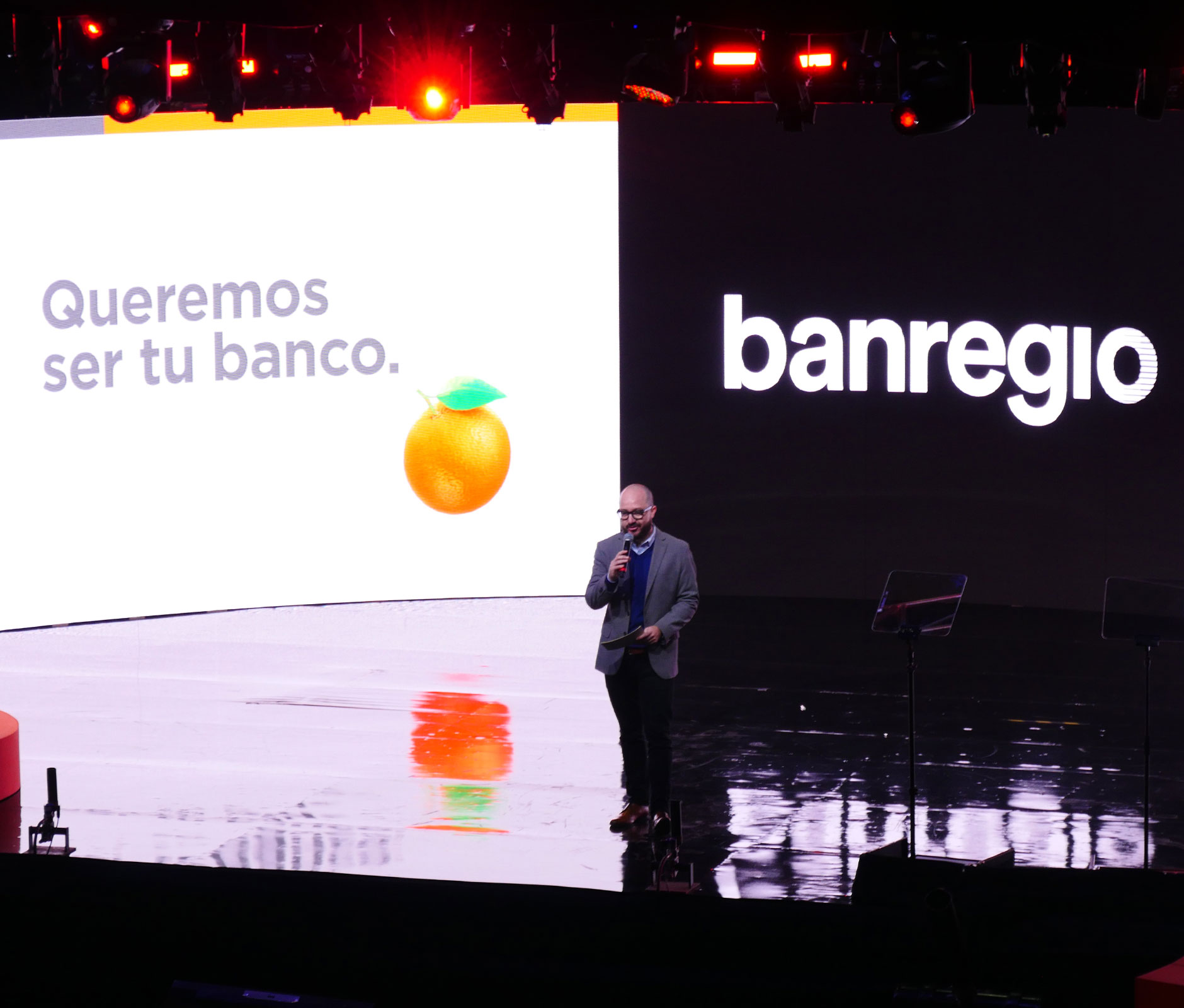
Then it was time to think about the cherry on top: Banregio's identity.
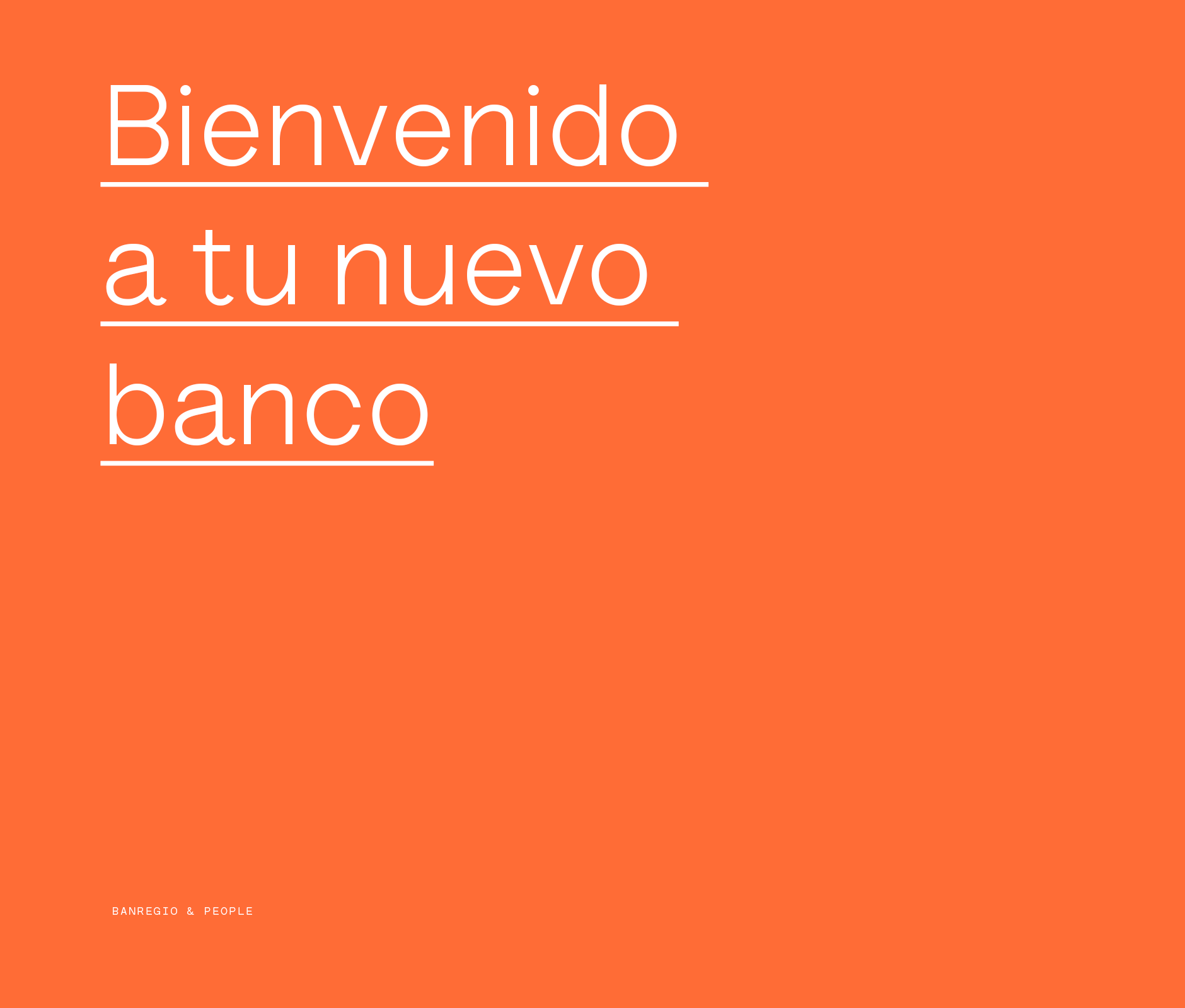
We wanted to bring their image up to date with everything else we were doing — to renew the energy and aesthetics of the brand without taking away from their history. We had two main goals: express Banregio’s vision for the future and, at the same time, intensify the internal culture and sense of belonging from within.
ENG / ESP
Banregio
nueva identidad
nueva energía
Brands&People x Banregio
Nos encanta la asociación creativa que tenemos con Banregio. Y nos encanta su historia. Nacido en 1994, durante uno de los momentos financieros más difíciles en nuestro país, este dinámico banco ha prosperado impulsando empresas, rompiendo convenciones y simplificando los servicios financieros para todos.
Desde que empezamos a trabajar con ellos en el 2016, nos hemos enfocado en mostrar fielmente quiénes son y qué los hace diferentes. Trabajamos de abajo hacia arriba, consolidando su comunicación estratégica a través de todos sus productos y servicios, dándole a la marca una voz refrescantemente irreverente con un enfoque proactivo de no decir, sino demostrar.
Después llegó el momento de pensar en la cereza del pastel: la identidad de Banregio.
Buscamos actualizarla para proyectar todo lo demás que estábamos haciendo. No para borrar la historia, sino más bien para renovar la energía y estética de la marca con dos objetivos principales: expresar la visión de Banregio hacia el futuro y, al mismo tiempo, intensificar la cultura interna y el sentido de pertenencia desde adentro.


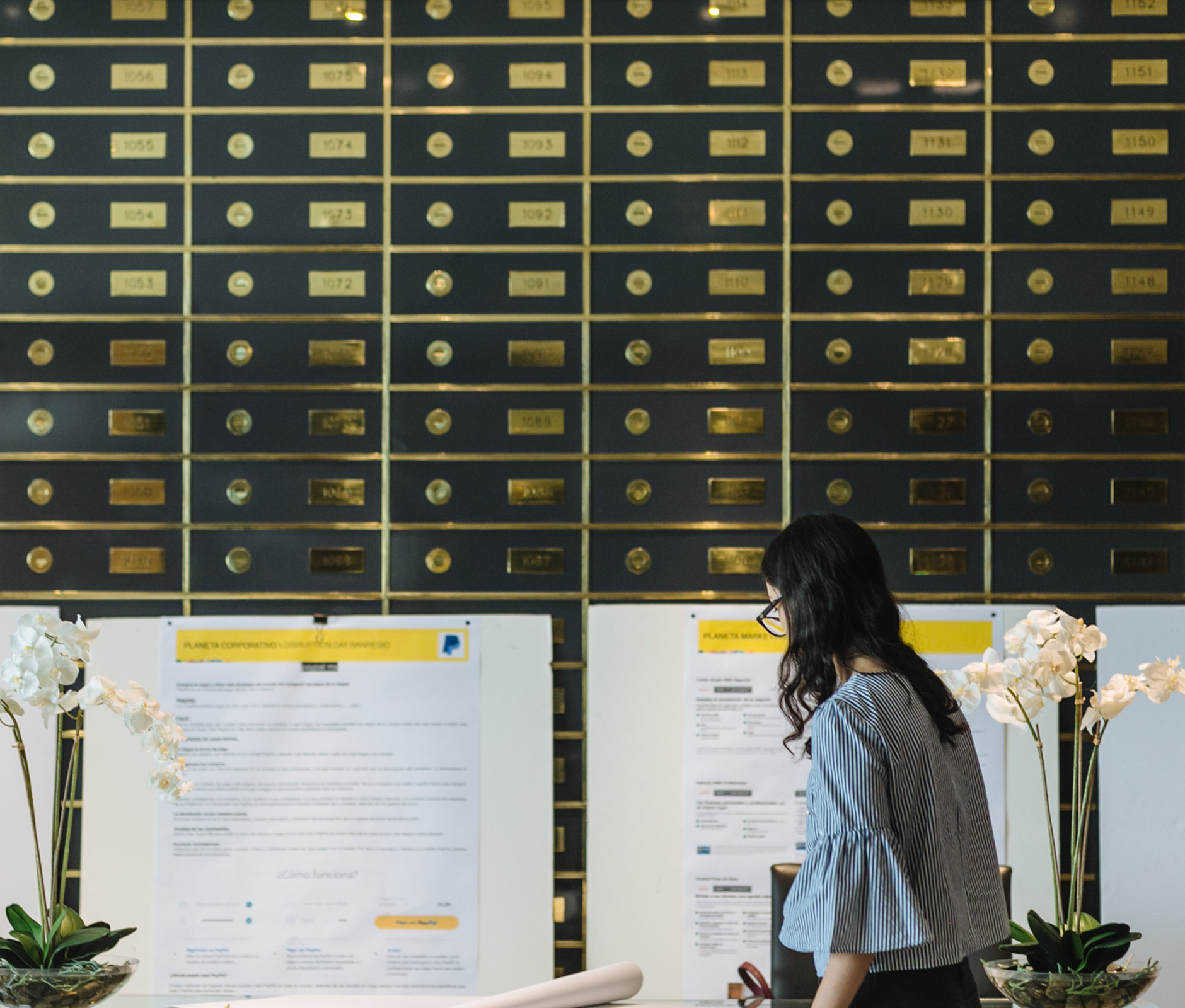
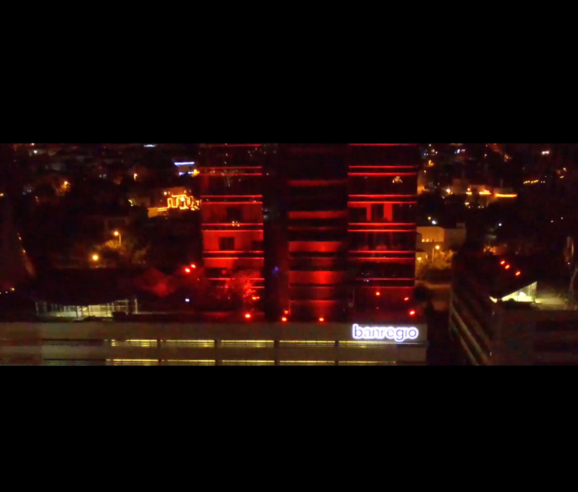
Banregio — Sucursal Naranja — Brand Story

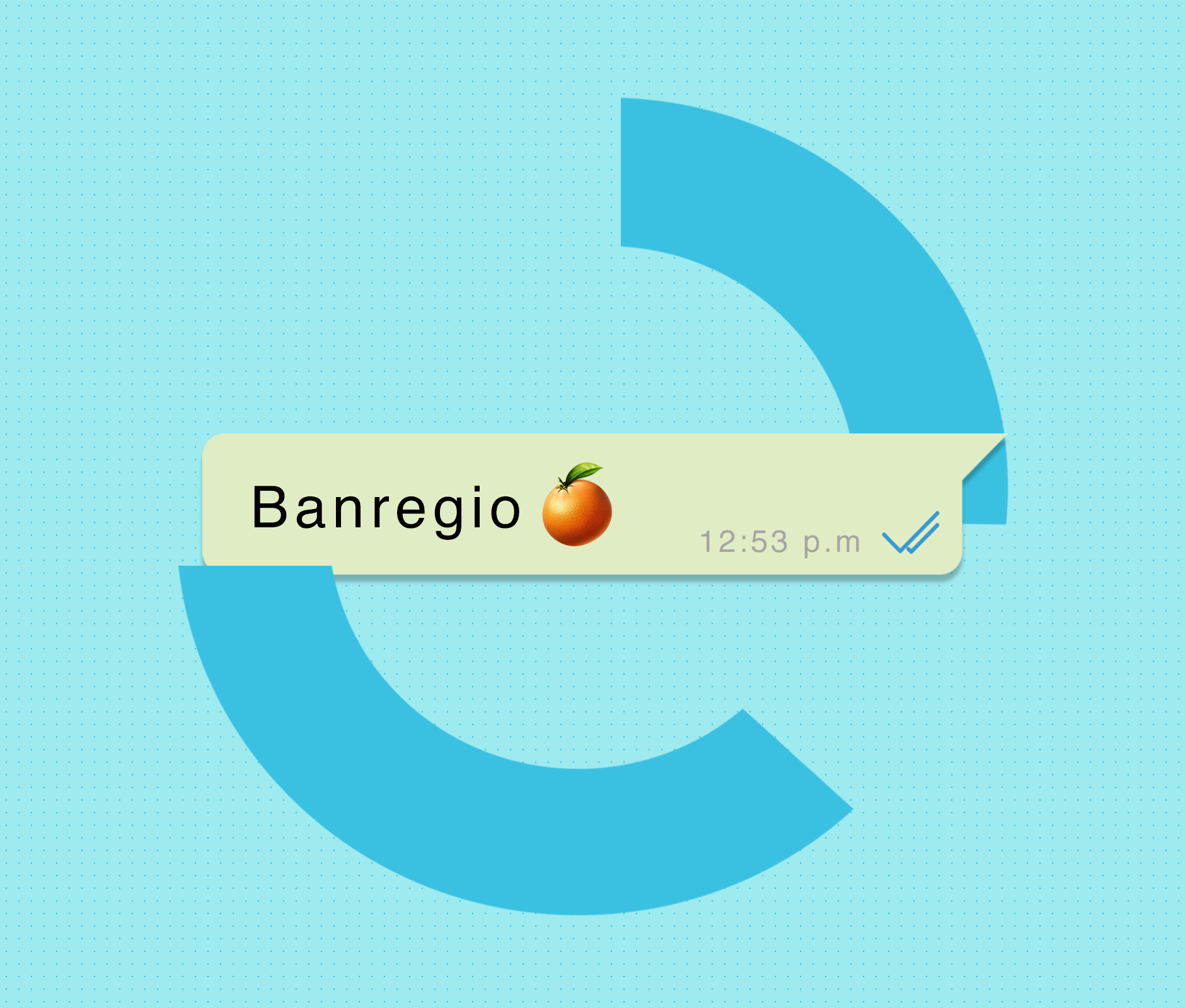
Banregio — Apple pay


ENG / ESP
-
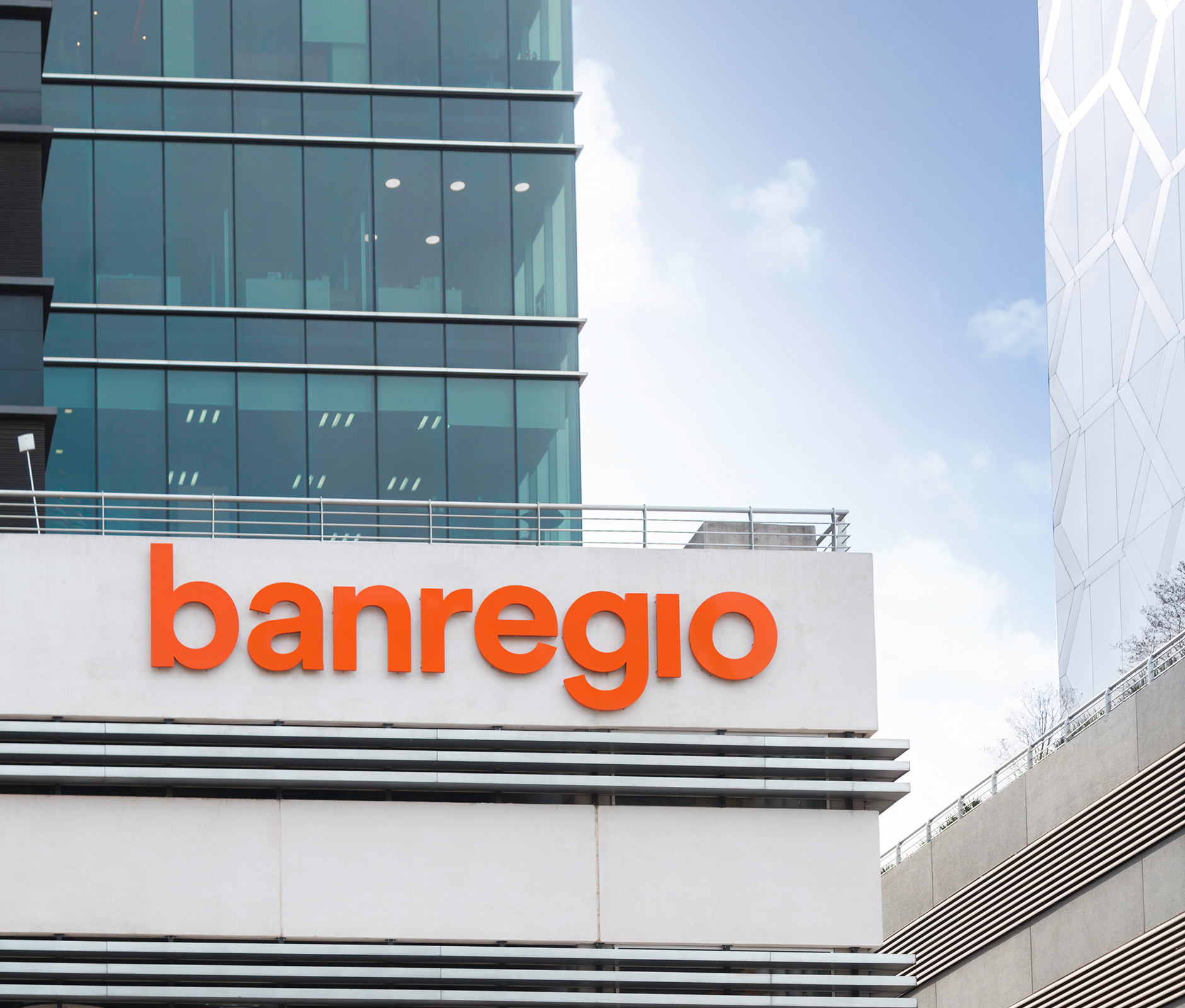
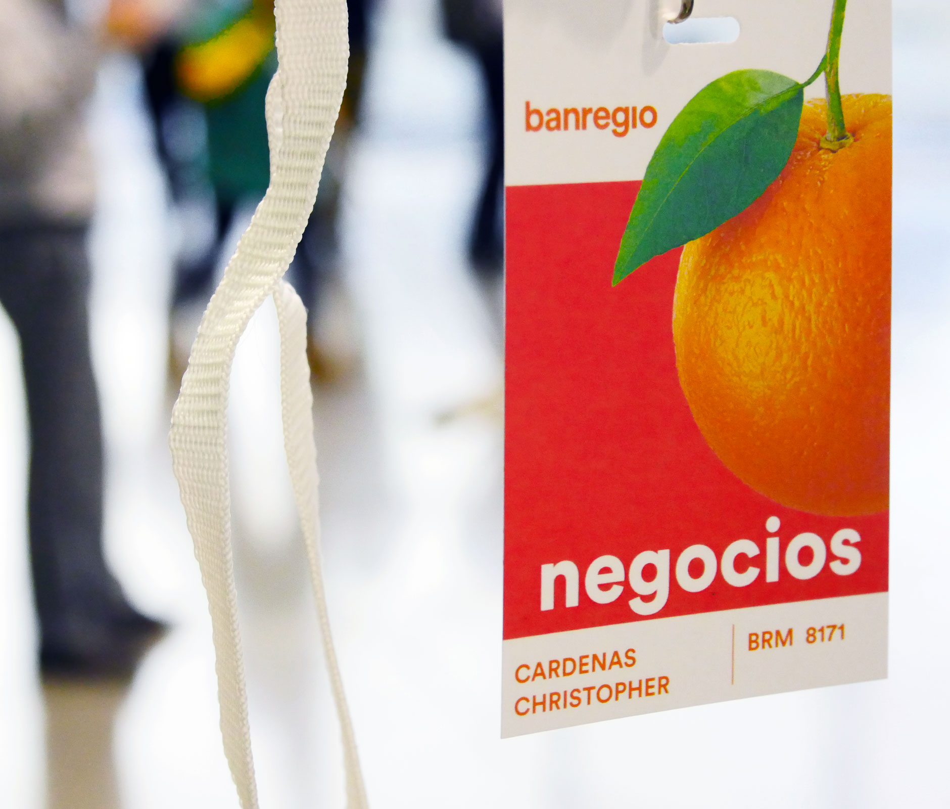
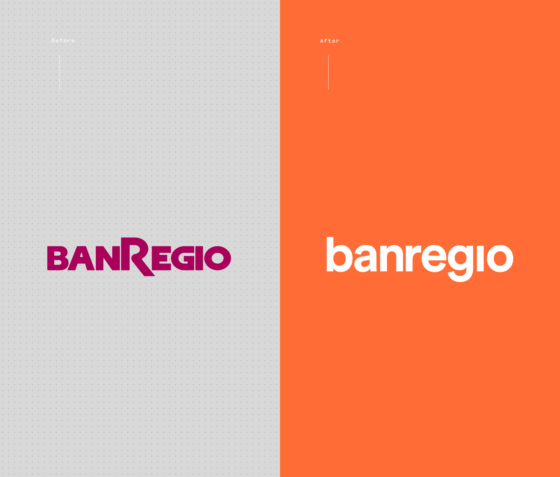
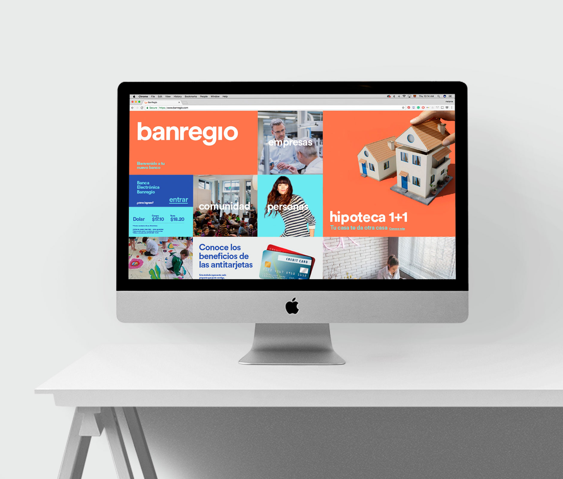
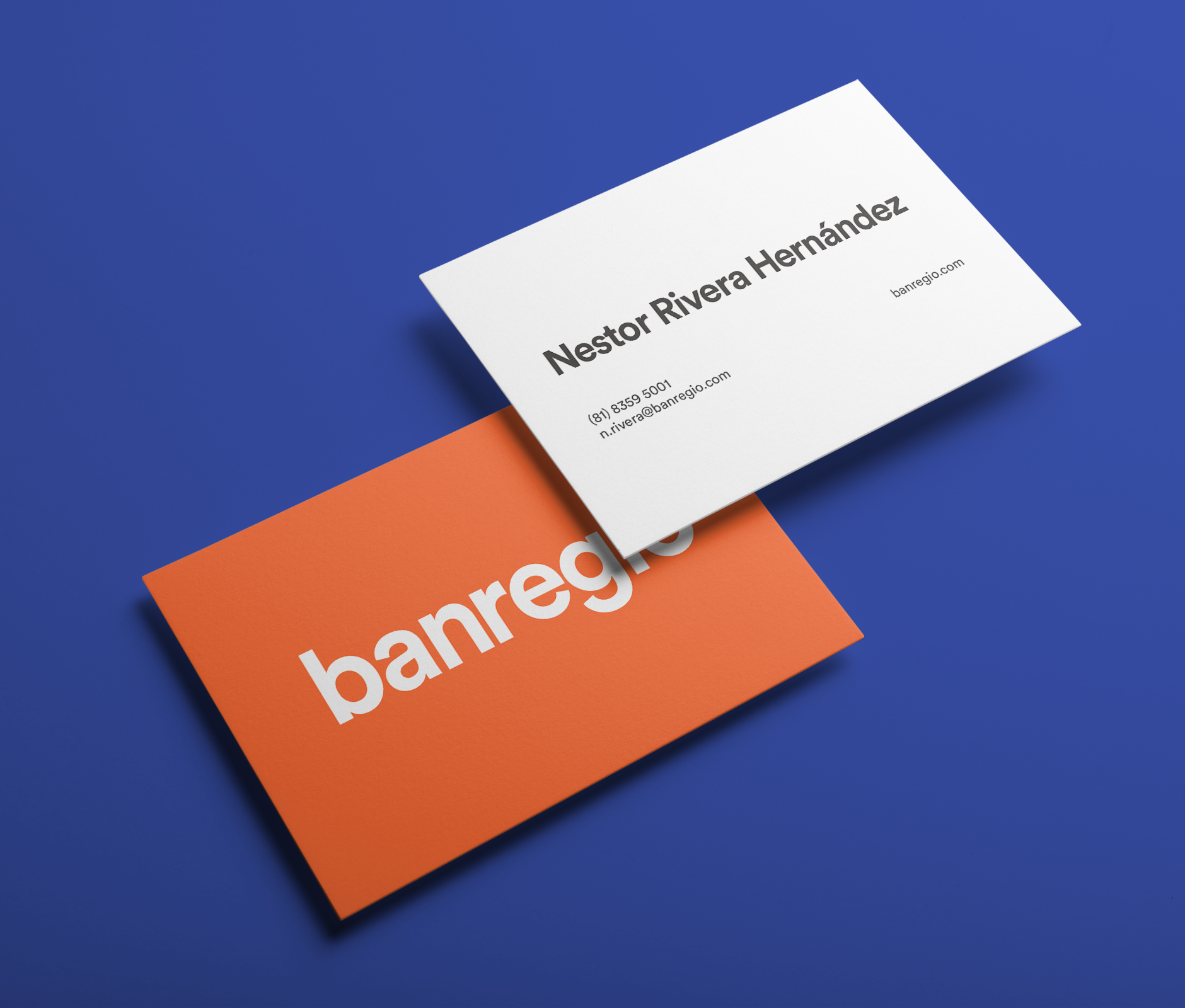
Orange is the new black
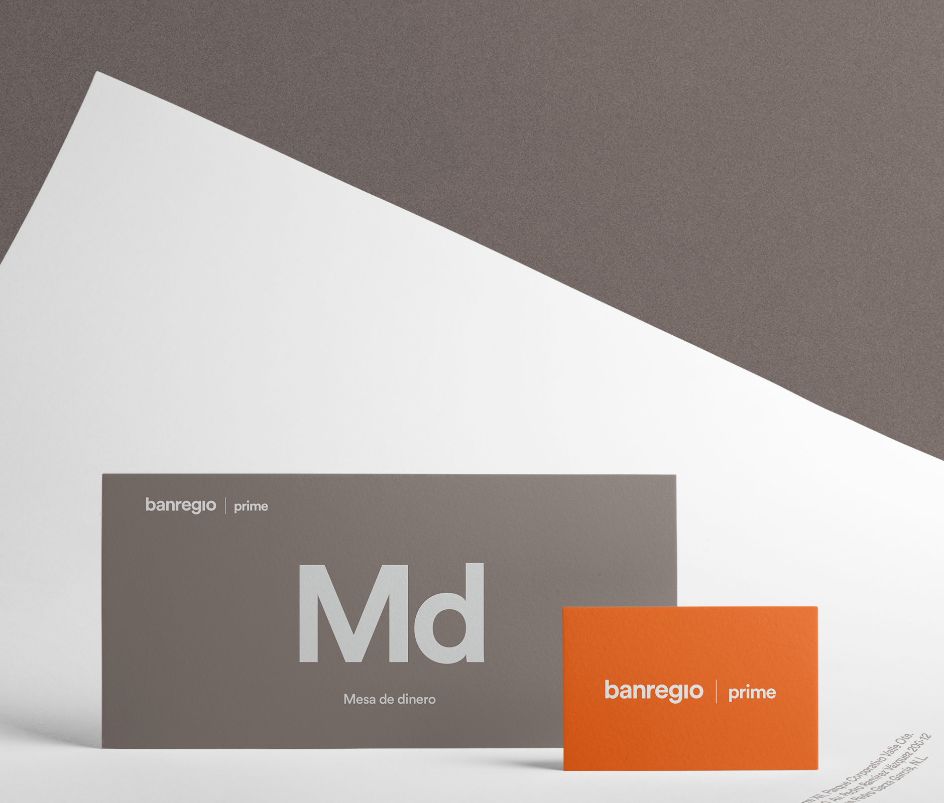
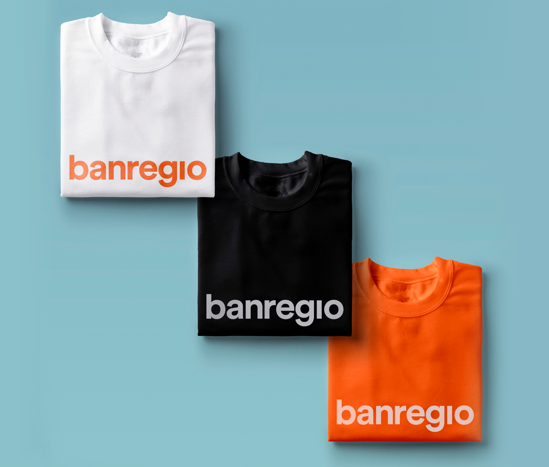
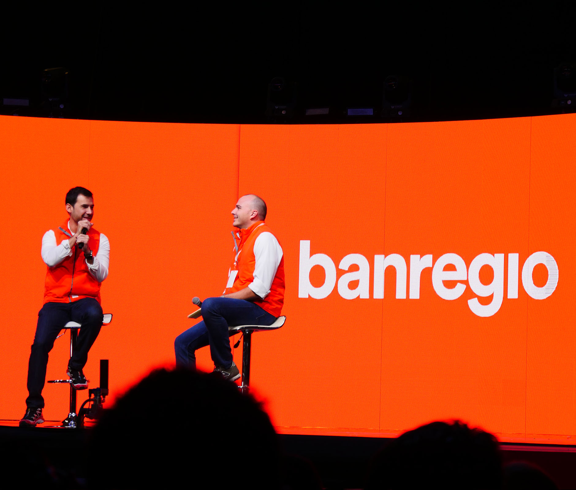
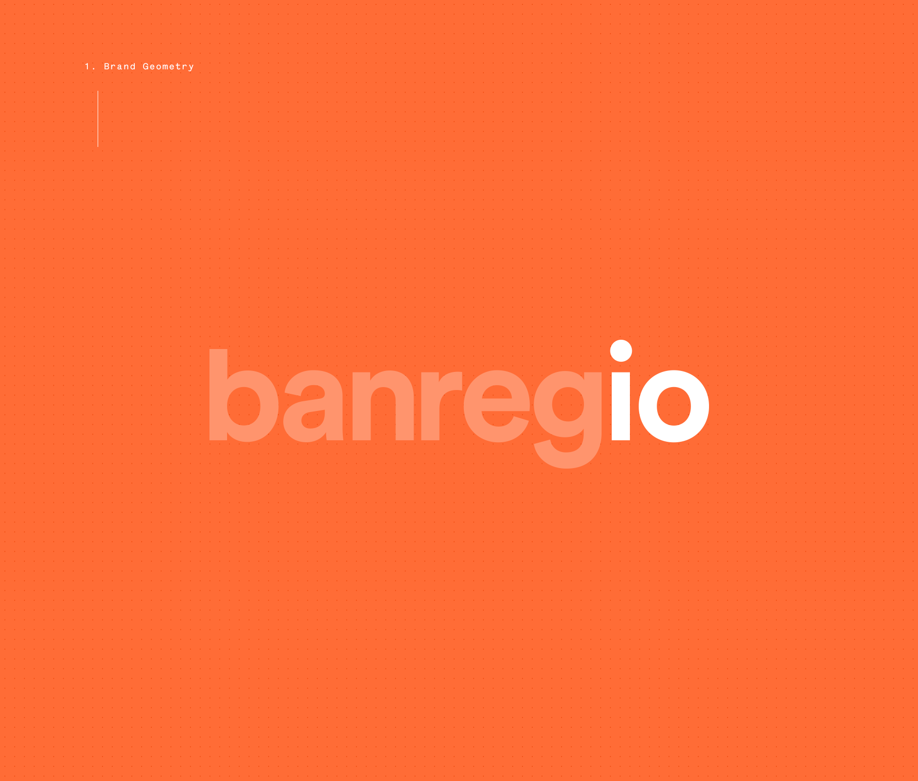
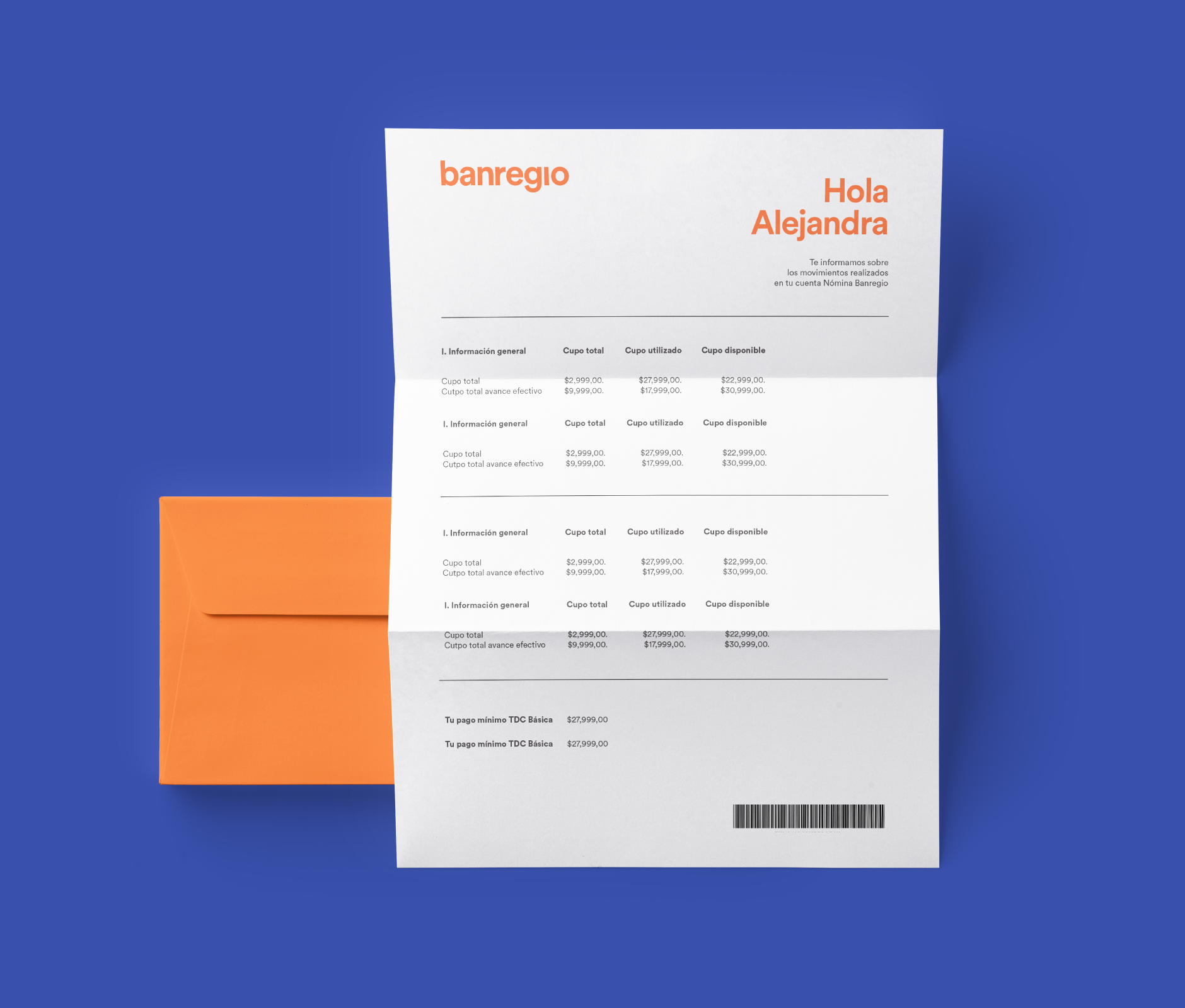
First, we took the brand from its traditional all-caps to lowercase, using a rounded and straight-forward typeface for a modern, relatable aesthetic.
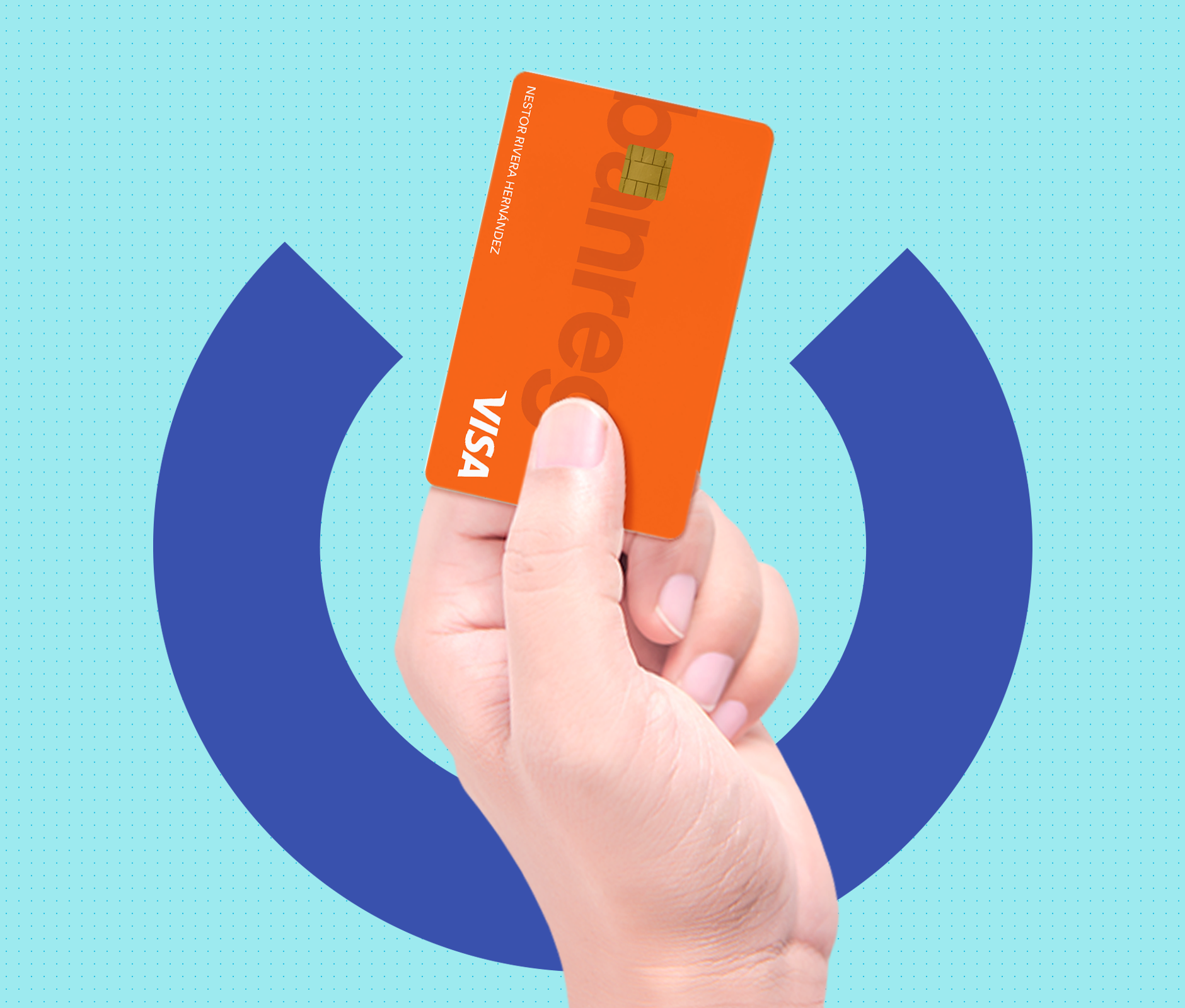
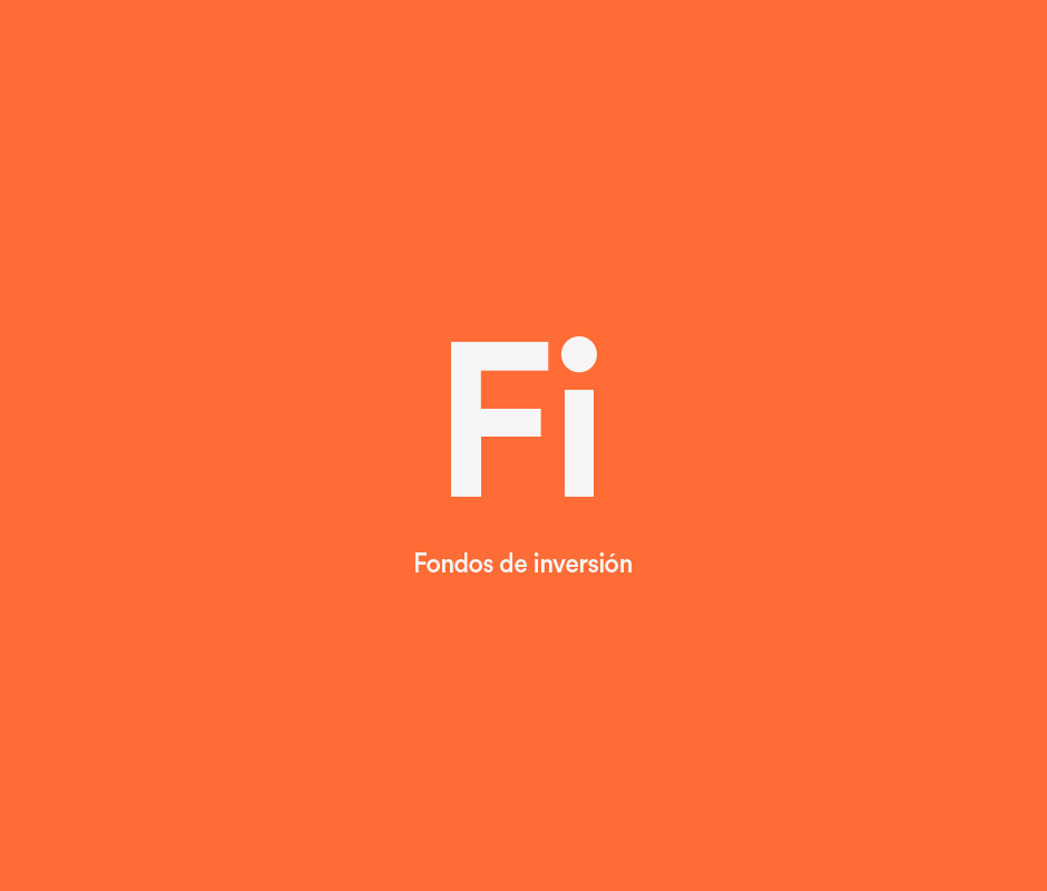
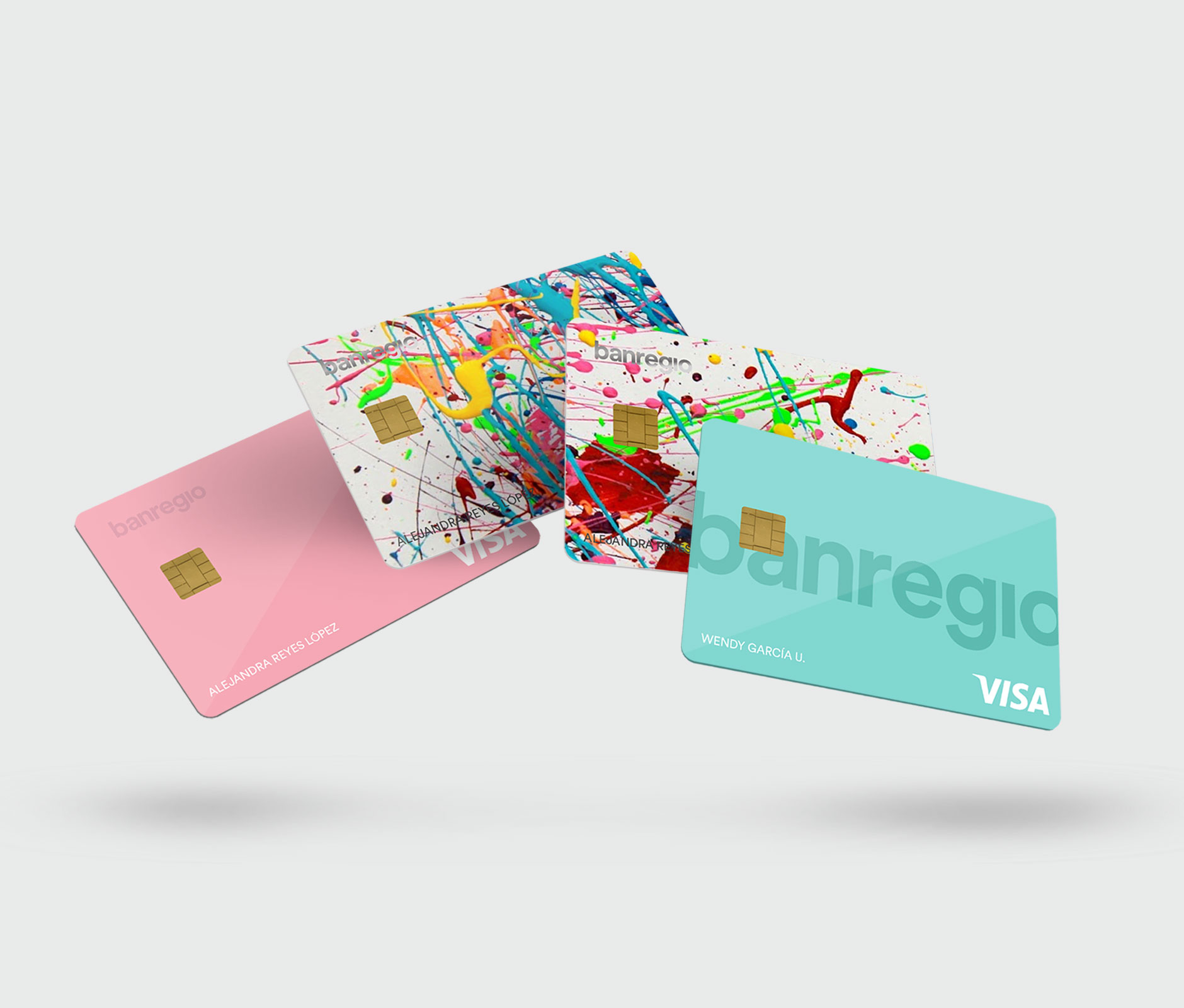
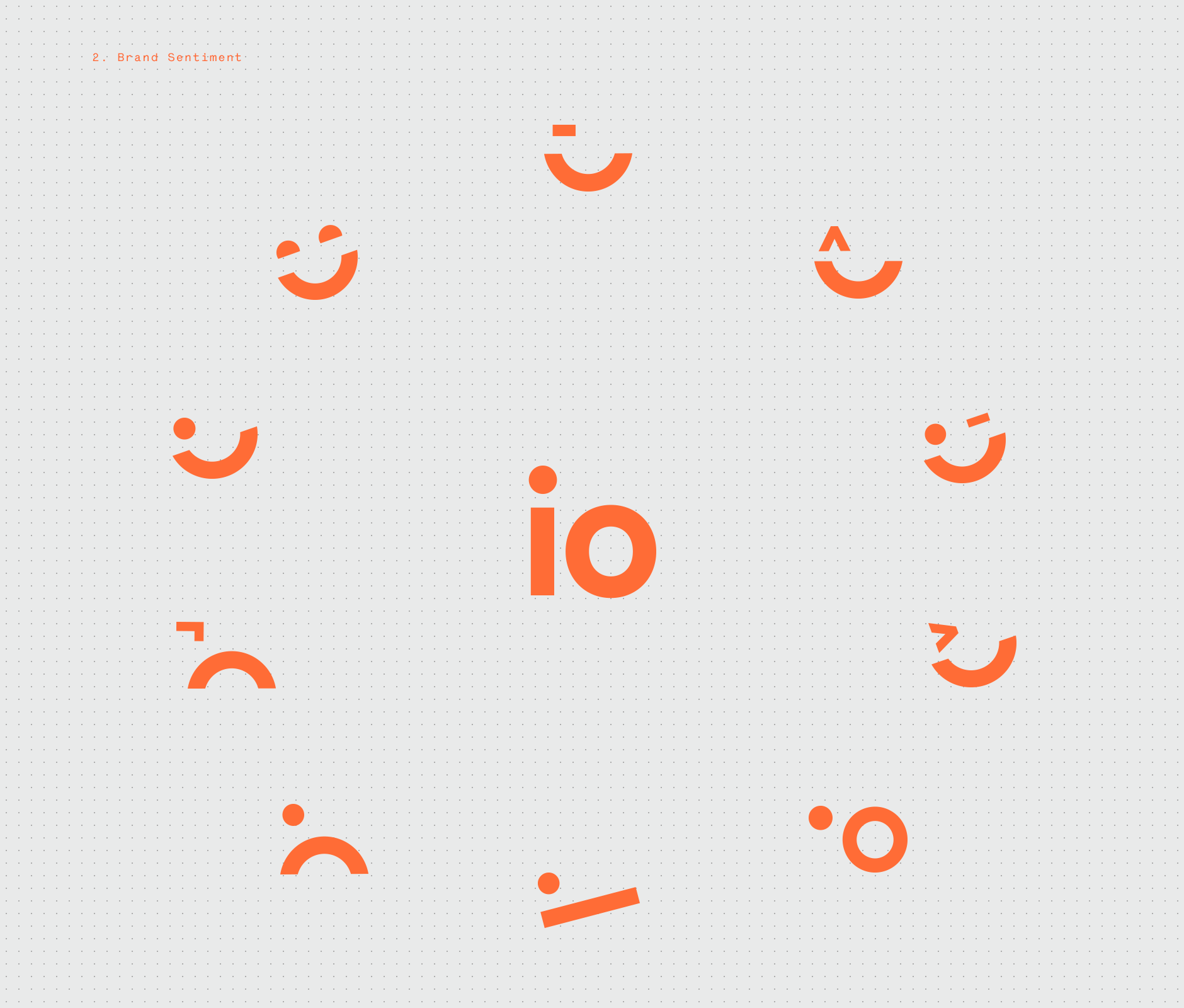
Then, instead of dotting the i, we broke it apart from the name and transformed it into a set of familiar visuals that convey different brand sentiments to elevate the personality and dynamism of the indetity to a whole new level.
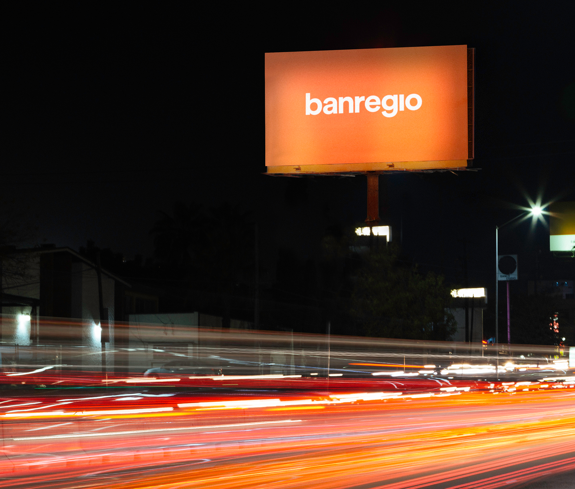
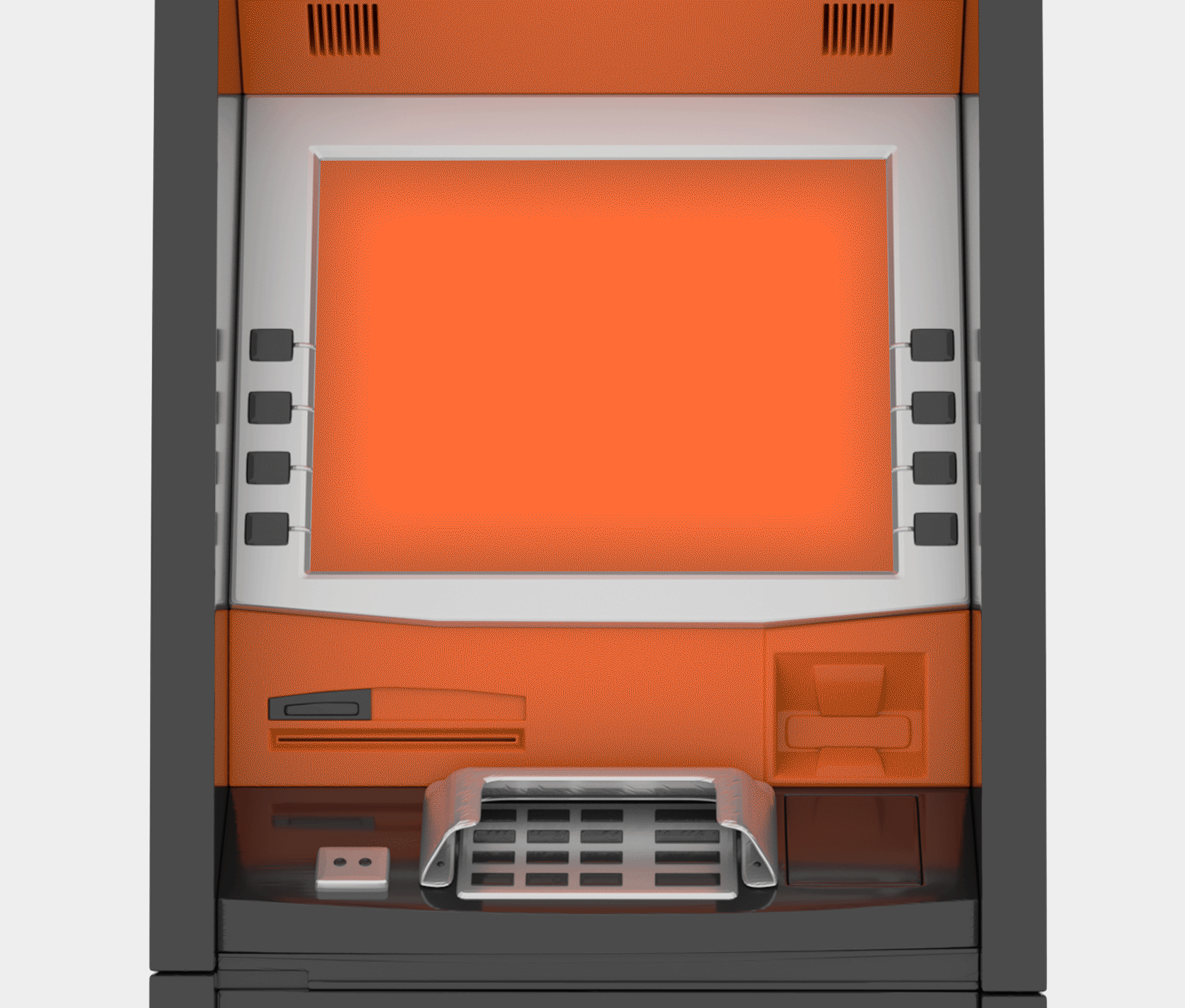
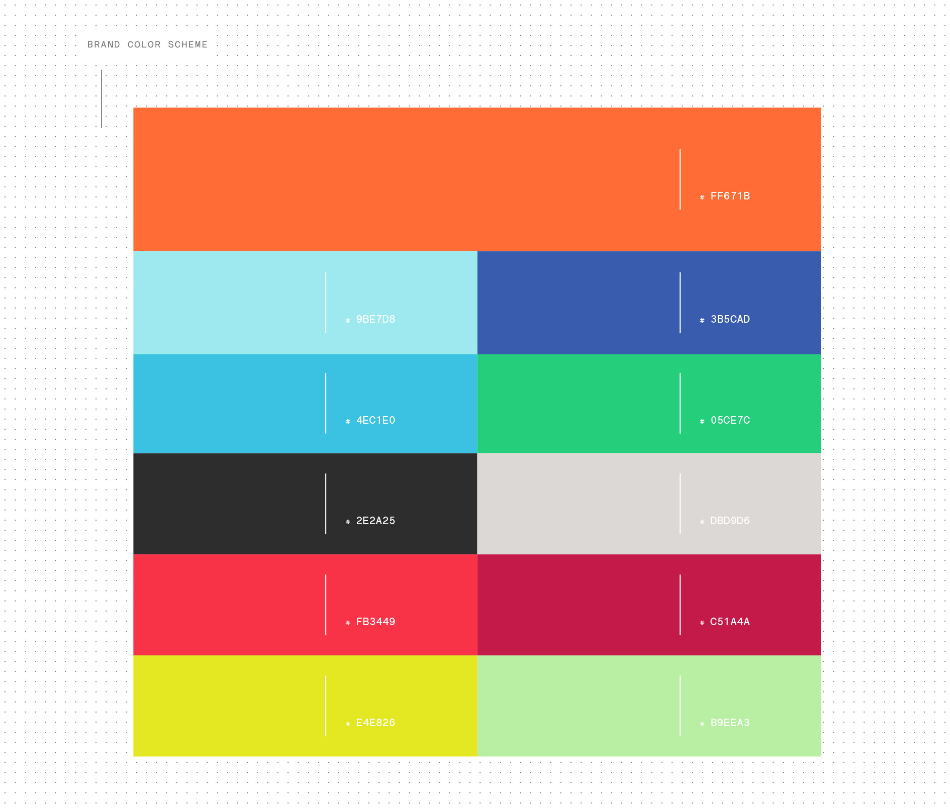
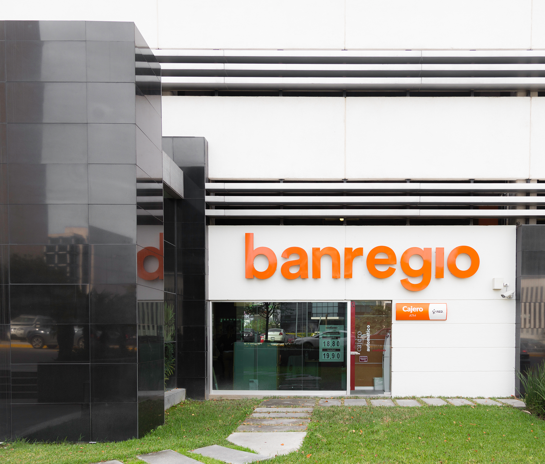
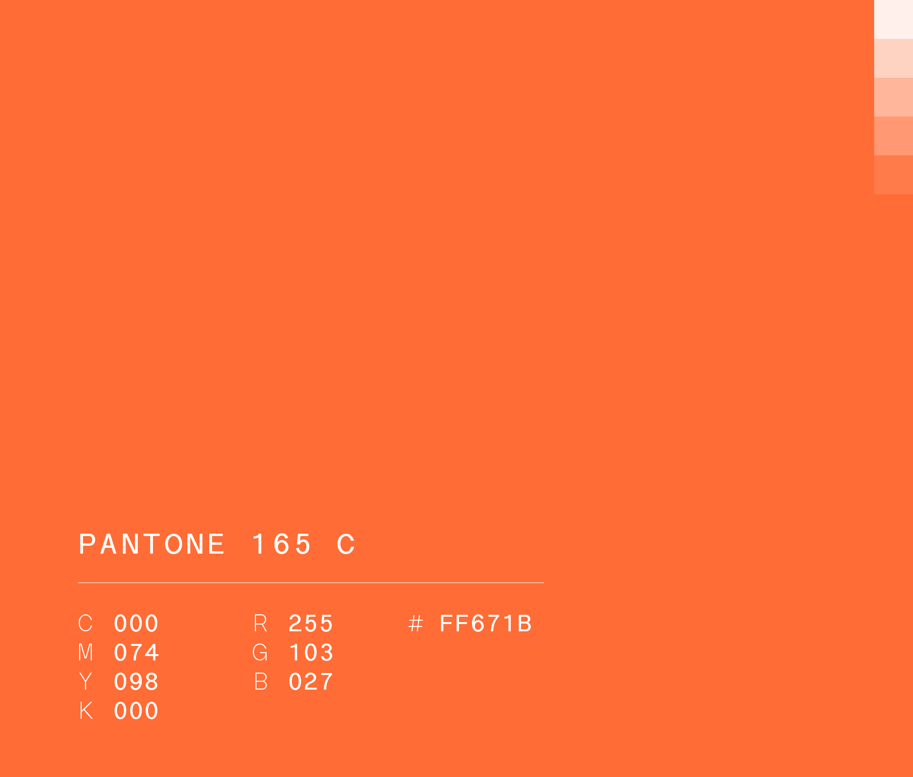
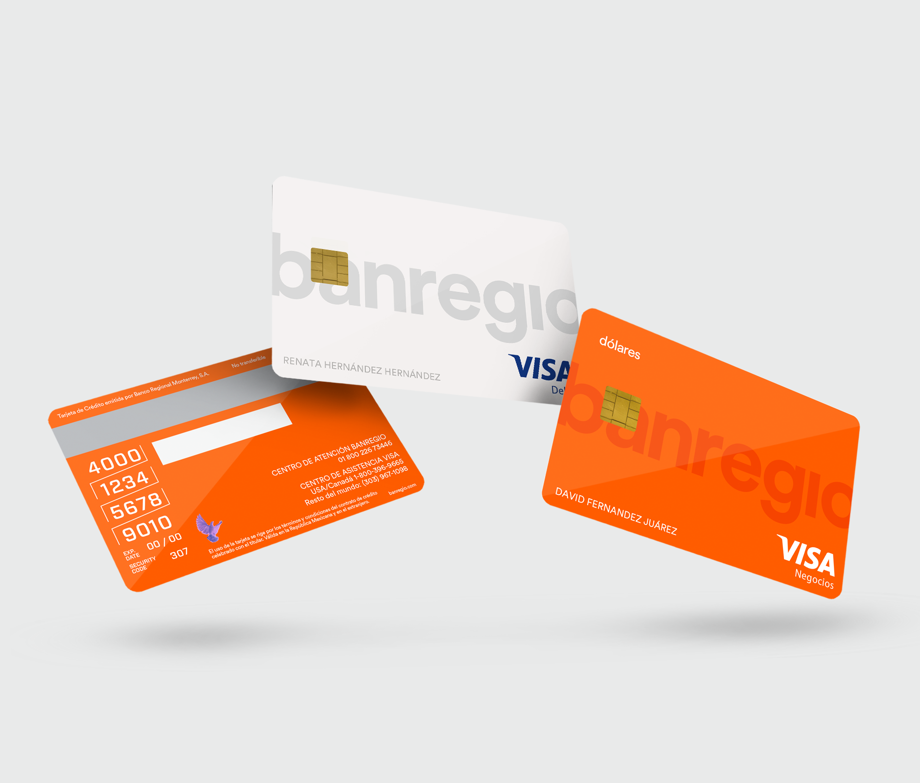
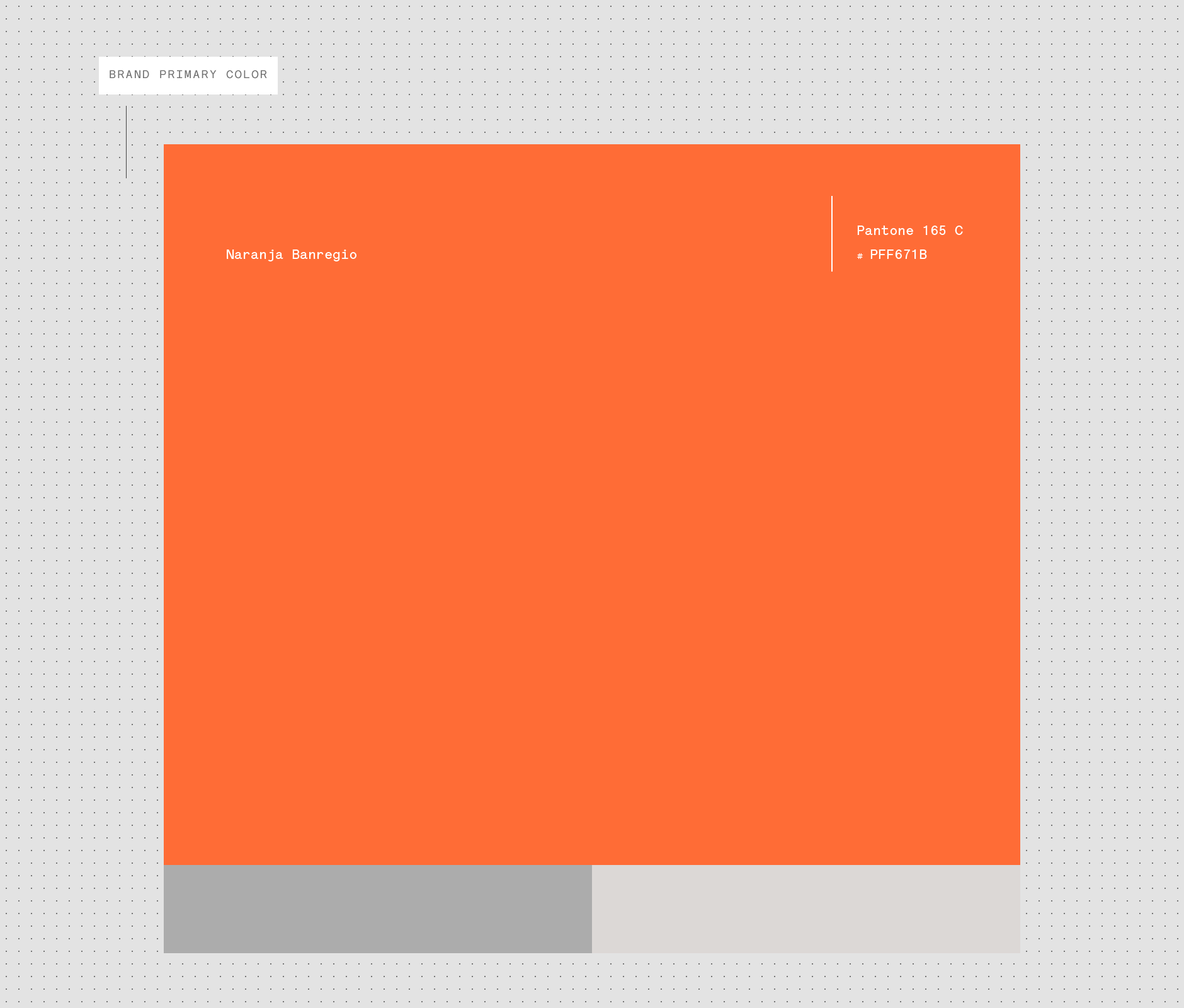
Finally, to tie it all together, we chose the orange tone to stand in contrast to the traditional institutional banking palette and to embody Banregio’s energy and innovation.
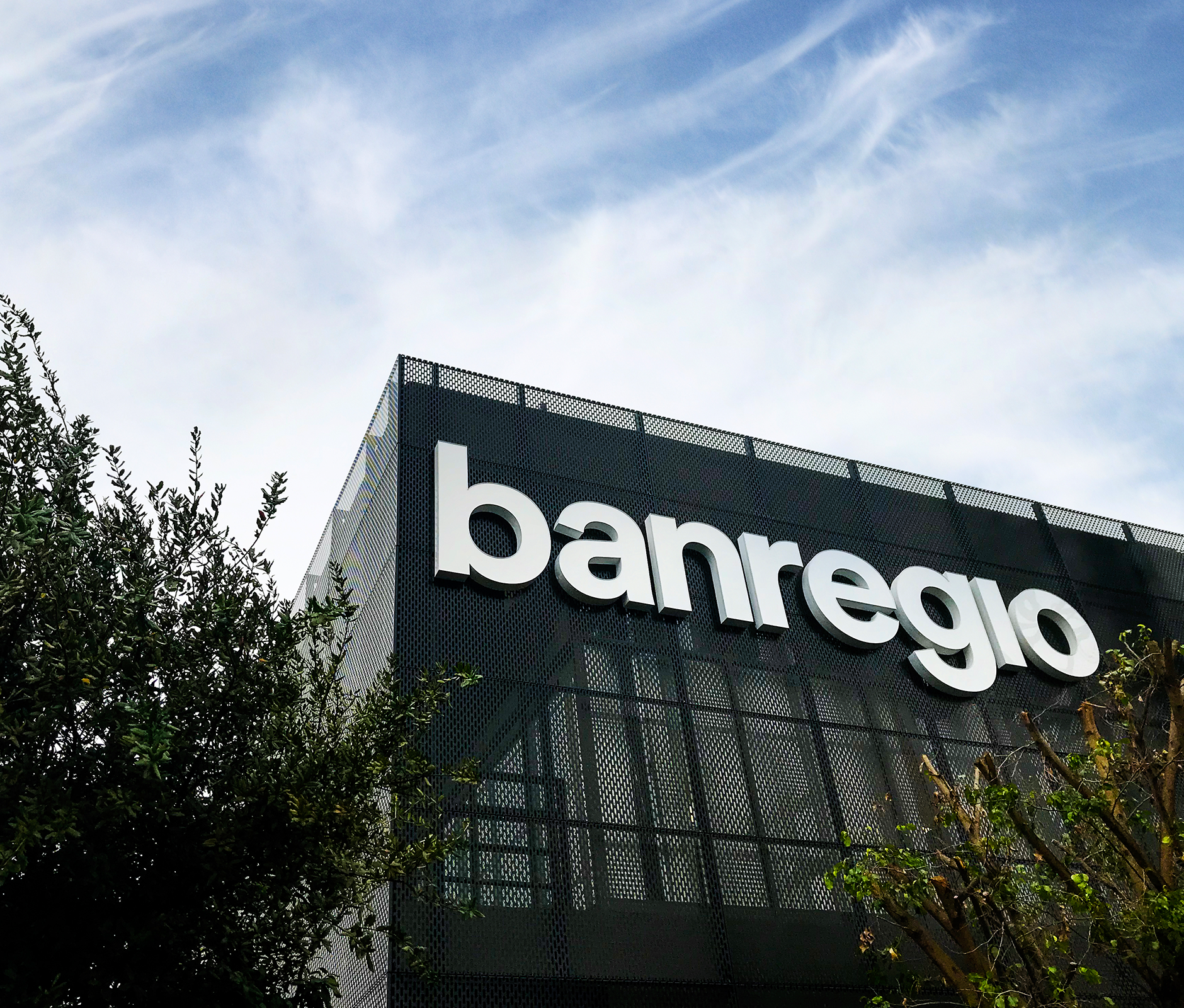
With this new brand color, we created an orange wave that reached inside the bank branches and throughout the city, fully embracing our evolution and inviting everyone to be a part of it.
These changes created a highly relatable identity that captured Banregio's evolution and at the same time highlighted the bank’s customer-centric approach, helping them express who they aspire to be: "the best bank for our clients."
ENG / ESP
-
Orange is the new black
Primero, cambiamos de mayúsculas a minúsculas, utilizando una tipografía redonda y simple, para hacer una marca legítimamente moderna y fácil de identificar.
Después, en lugar de colocar el punto sobre la i, decidimos separarlo del nombre y transformarlo en un conjunto de grafismos independientes que ayudan a transmitir diferentes estados de ánimo de la marca de una manera que todos pueden reconocer, dándole un nuevo nivel de dinamismo y personalidad.
Finalmente, para unir todo, elegimos el tono naranja para separarnos de la paleta típica de la banca institucional y también transmitir la energía y espíritu innovador de Banregio.
Con este nuevo color de marca, creamos una ola naranja que se extendió dentro de las sucursales bancarias y en toda la ciudad, apropiándonos de nuestra evolución e invitando a todos a formar parte de ella.
Estos cambios crearon una identidad relevante que caracteriza de manera clara la evolución de Banregio y al mismo tiempo magnifica su enfoque hacia el cliente, ayudándoles a expresar el tipo de banco que quieren ser: "el mejor banco para nuestros clientes".


ENG / ESP
Financial empathy
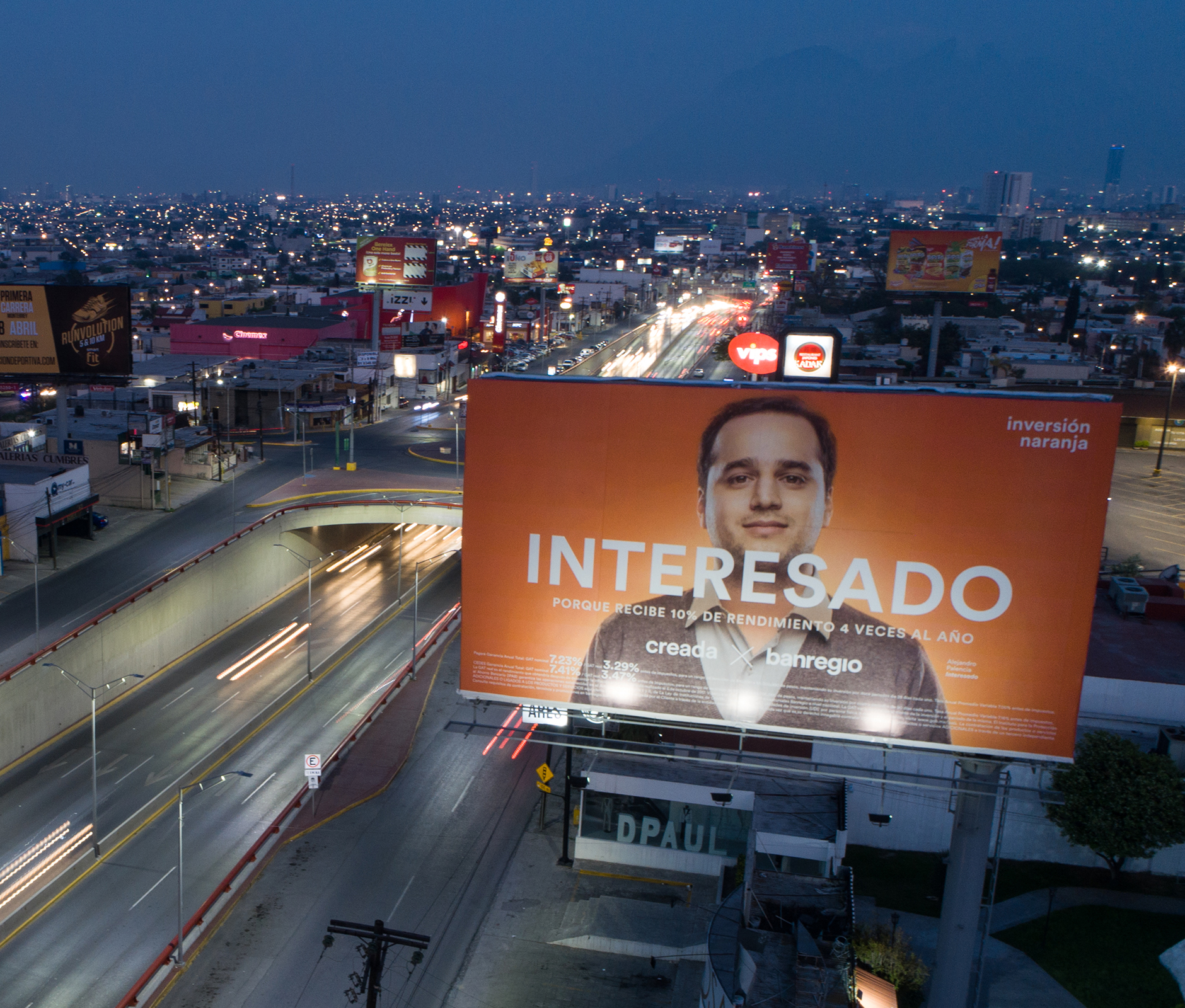
We launched our new identity through two streamlined new products: the Orange Savings Account and the Orange Investment — both cleverly designed to simplify financial decision-making.
For the Orange Savings Account, we paired our orange branding with the actual fruit to double down on how Banregio offers a refreshed and cleaner way of banking. For the Orange Investment, we created the "Interested" campaign — a fun way to redefine a concept often perceived as negative, to empower clients who unapologetically demand more from their bank.
Going a step beyond the logo change, we aimed to amplify the role of Banregio in the lives of customers. We created a Banregio brand strongly associated with caring for customers’ needs — a brand known for being in tune with the communities it serves and savvy to customers’ evolving digital habits.
And instead of just selling financial products, we shifted the conversation to real-life situations that customers can relate to and that inspire them to look at their finances more closely and more optimistically.
We are excited about what’s next. We look forward to working with Banregio to help it continue to thrive by offering unparalleled financial solutions and experiences. Always making sure that when it comes to banks, Banregio is the orange to all those other banks’ apples.
ENG / ESP
Empatía financiera
Lanzamos nuestra nueva identidad a través de dos nuevos productos optimizados: la Cuenta Naranja y la Inversión Naranja. Ambos productos vienen a simplificar las decisiones financieras de los clientes.
Para la Cuenta Naranja, emparejamos nuestra identidad naranja con la fruta real para recalcar cómo Banregio ofrece una forma refrescante y más limpia de hacer banca. Para la Inversión Naranja, creamos la campaña "Interesados". Una forma divertida de redefinir un concepto que se percibe como negativo, empoderando a aquellos clientes que no les avergüenza obtener más de su banco.
Así que más allá de hacer un cambio en el logotipo, buscamos amplificar el rol de Banregio en la vida de las personas. Queríamos que Banregio se convirtiera en una marca más empática demostrando ser el banco que está en sintonía con las necesidades de la comunidad y la constante transformación de sus hábitos digitales.
En lugar de simplemente vender productos financieros, también nos enfocamos en hablar sobre situaciones de la vida real con las que los clientes se pueden identificar y que los mueven a mirar sus finanzas con una perspectiva más integral y optimista.
Nosotros también nos sentimos entusiasmados por el futuro. Continuaremos trabajando con Banregio, para que siga haciendo lo que mejor sabe hacer: crear incomparables soluciones y experiencias financieras. Para que cuando hablemos de bancos, Banregio sea siempre la naranja entre las manzanas.